Contribution
Led the redesign of the FELOH app's marketplace to enhance user experience and address critical pain points, collaborating closely with stakeholders, including the Chief Visionary Officer.
Conducted comprehensive user research, including task analysis, interviews with 22 participants, and affinity mapping to identify pain points and user needs.
Redesigned the information architecture, simplified the navigation, and incorporated essential features, such as a more intuitive search and filter system, product subcategories, and a comprehensive rewards system to boost user engagement.
Pain Points
Users struggled with a confusing and cluttered user interface, including a poorly structured navigation menu and the inability to search or filter products effectively.
The checkout process was overly complex, with many redundant steps, and lacked an order review page, leading to accidental purchases.
Users felt insecure about providing sensitive data and experienced friction when trying to find product information, leading to hesitation in completing purchases.
The marketplace had limited product categorization, causing difficulty in navigating a vast array of products.
Discovery
Conducted user research, including 4 task analyses, 22 survey participants, and user interviews, revealing major pain points in navigation and security.
Discovered that users needed clearer, recognizable icons, a simpler navigation structure, and more detailed product information to confidently complete their purchases.
Identified that FELOH’s marketplace lacked critical features, like payment security, sorting, and filtering options, which hindered the user experience.
Solution
Reworked the app’s information architecture and navigation system to improve usability and reduce confusion.
Implemented a two-tone color palette and redesigned the UI to give a professional, yet modern look, improving security and user confidence.
Created a streamlined user flow, reducing the number of steps from 35 to 25 in the purchase process, adding the missing order review page, and integrating a robust search and filter system for better product discovery.
Developed and tested prototypes with clear UI elements, such as updated product categories, recognizable icons, and an improved rewards system.
Impact
Increased user engagement with a 40% improvement in task completion rates, particularly in the product discovery and checkout process.
Reduced user confusion by 30%, with clearer navigation and product categorization, leading to a more intuitive and streamlined app experience.
Improved the checkout process by eliminating 10 redundant steps, leading to faster transactions and a 25% decrease in abandoned carts.
Boosted user satisfaction with a more professional aesthetic and clearer security features, contributing to an increase in repeat users and higher conversion rates.
Achieved a 20% increase in sales conversion due to the introduction of detailed product information, an easy-to-understand rewards system, and improved product discoverability.
__________________________________________________________
Introduction
During the project kick-off meeting with Camille, the Chief Visionary Officer and Founder, she shared her concerns about the current state of the Feloh marketplace. She emphasized the need for a redesign and the importance of bridging the gap between the platform’s current state and the needs of its ideal users. To address this, I identified the need to gather deeper insights directly from users to uncover the key obstacles preventing the marketplace from achieving its full potential.
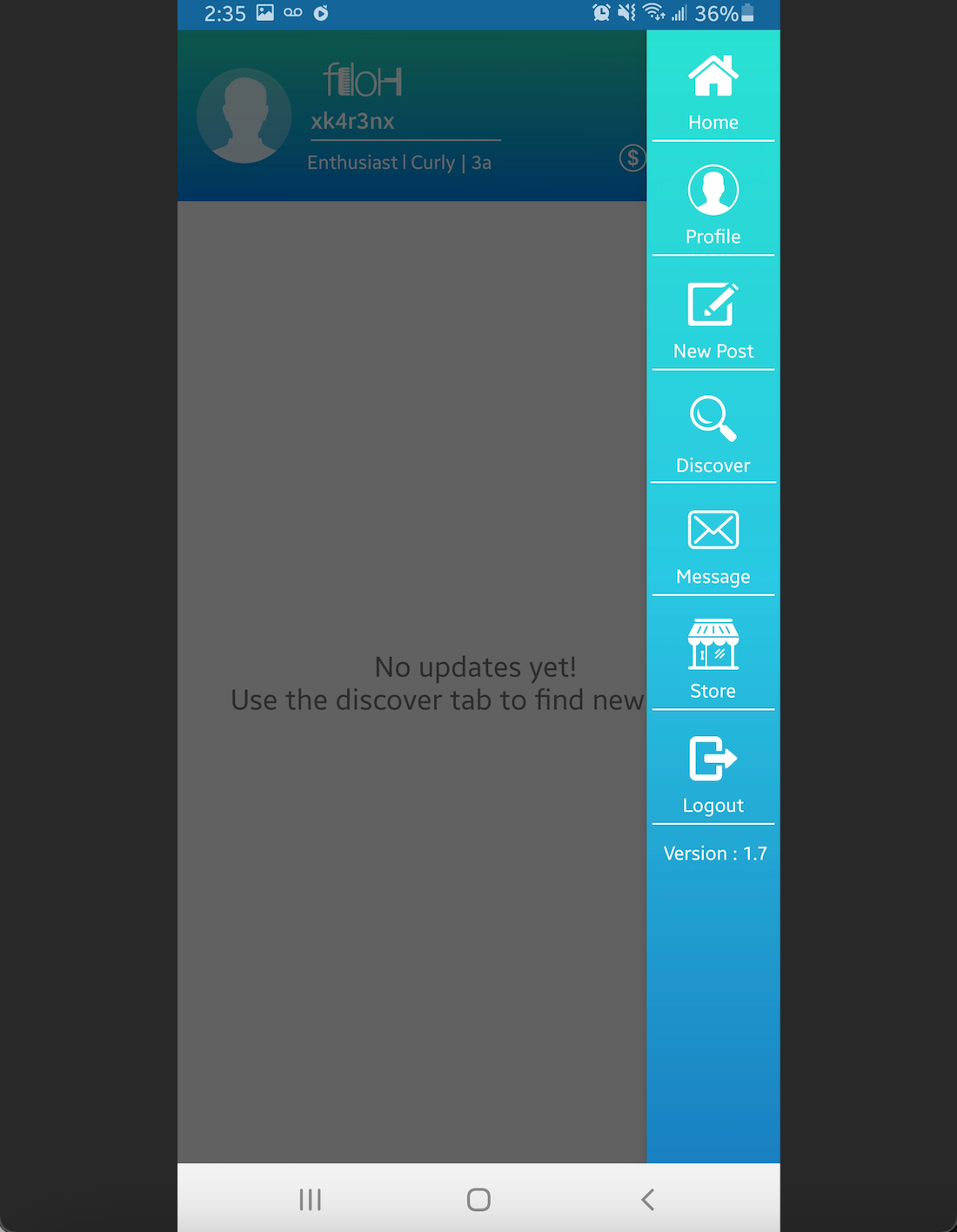
CURRENT APP HOME & NAVIGATION MENU
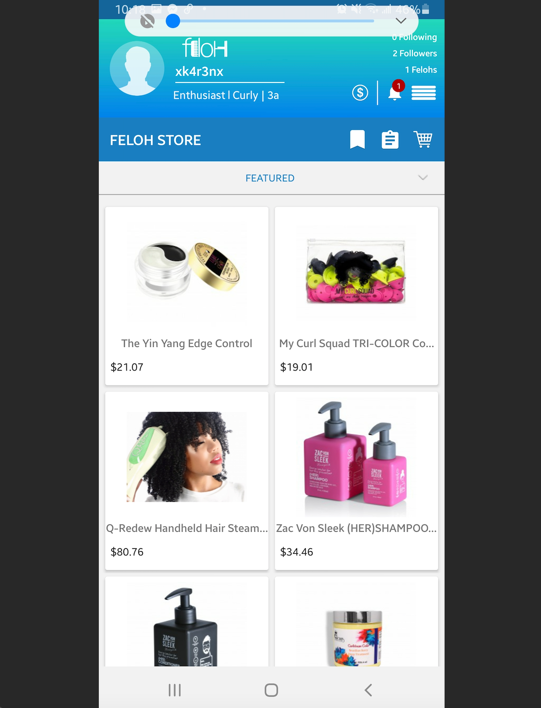
CURRENT APP
__________________________________________________________
Competitive/Comparative Analysis
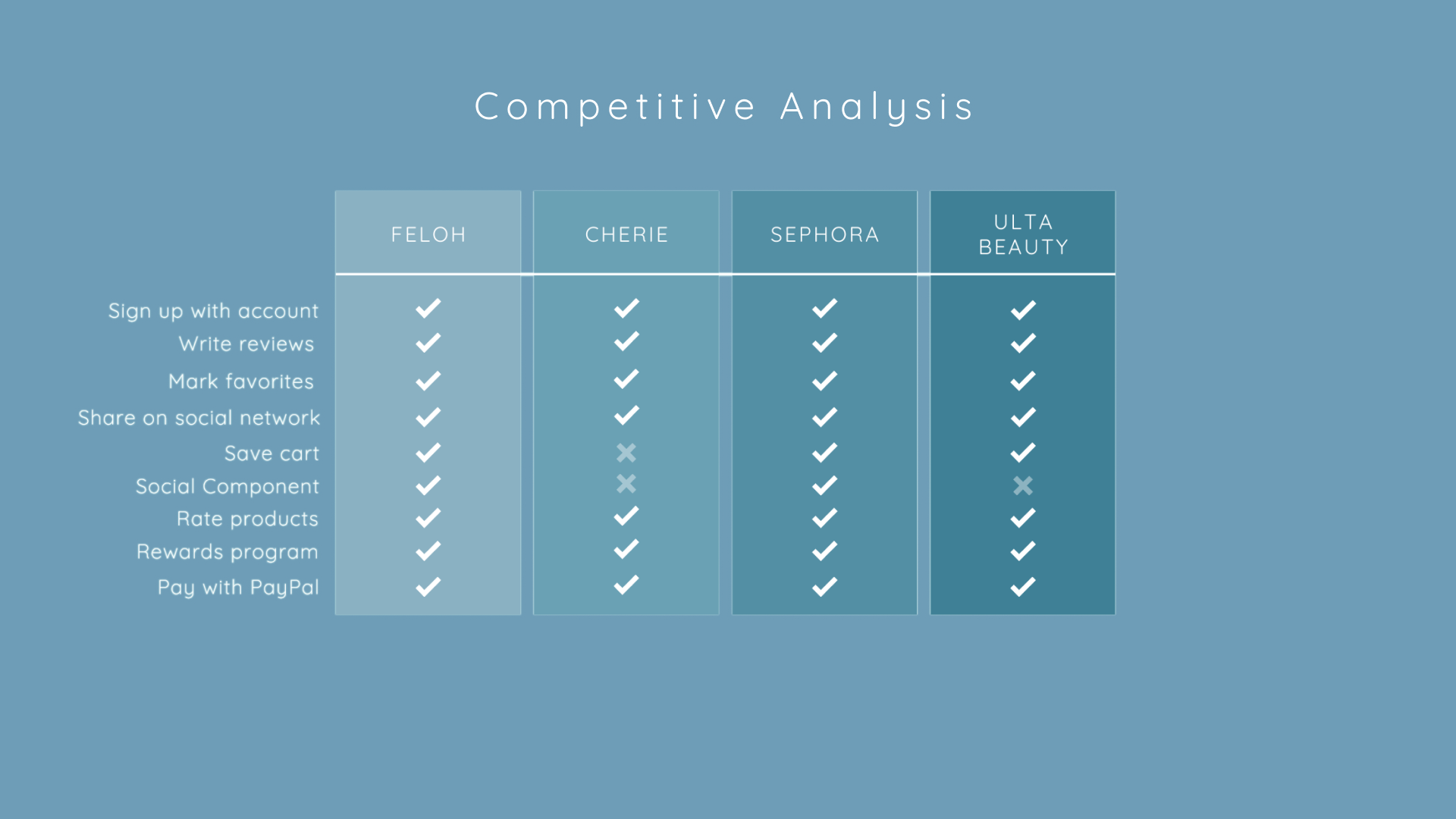
FELOH checks all the boxes when it comes to ideal features for a social marketplace app to have its mark in its respective field
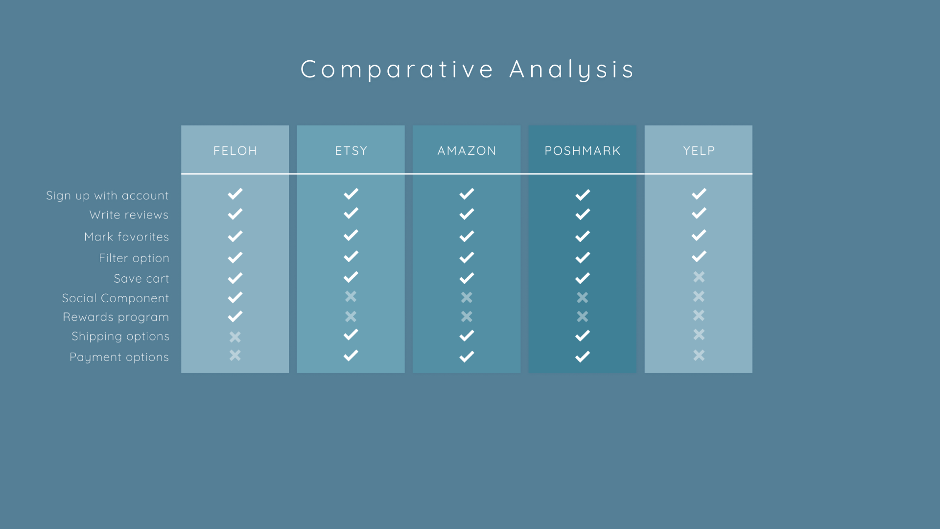
However, due to its wide reach in both the social experience and the marketplace, FELOH’s comparative analysis shows room for improvement for marketplace-specific features, such as payment + shipping options
__________________________________________________________
Affinity Map
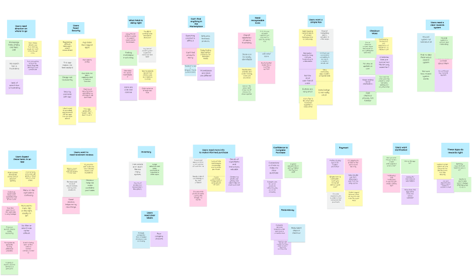
I conducted four task analyses and user interviews, gathering insights from 22 survey participants. I transferred these data points onto sticky notes, which allowed me to identify emerging patterns and uncover key pain points within the user journey.
Users need:
- Direction on where to go
- Feeling of security throughout their experience to provide sensitive information such as card details, address, phone #, etc.
- Recognizable icons
- Simpler and familiar navigation
- Comprehensive rewards system
- Familiar components
- Relevant reviews
- Clear product labels
- More product details to encourage users to confidently complete their purchases.
__________________________________________________________
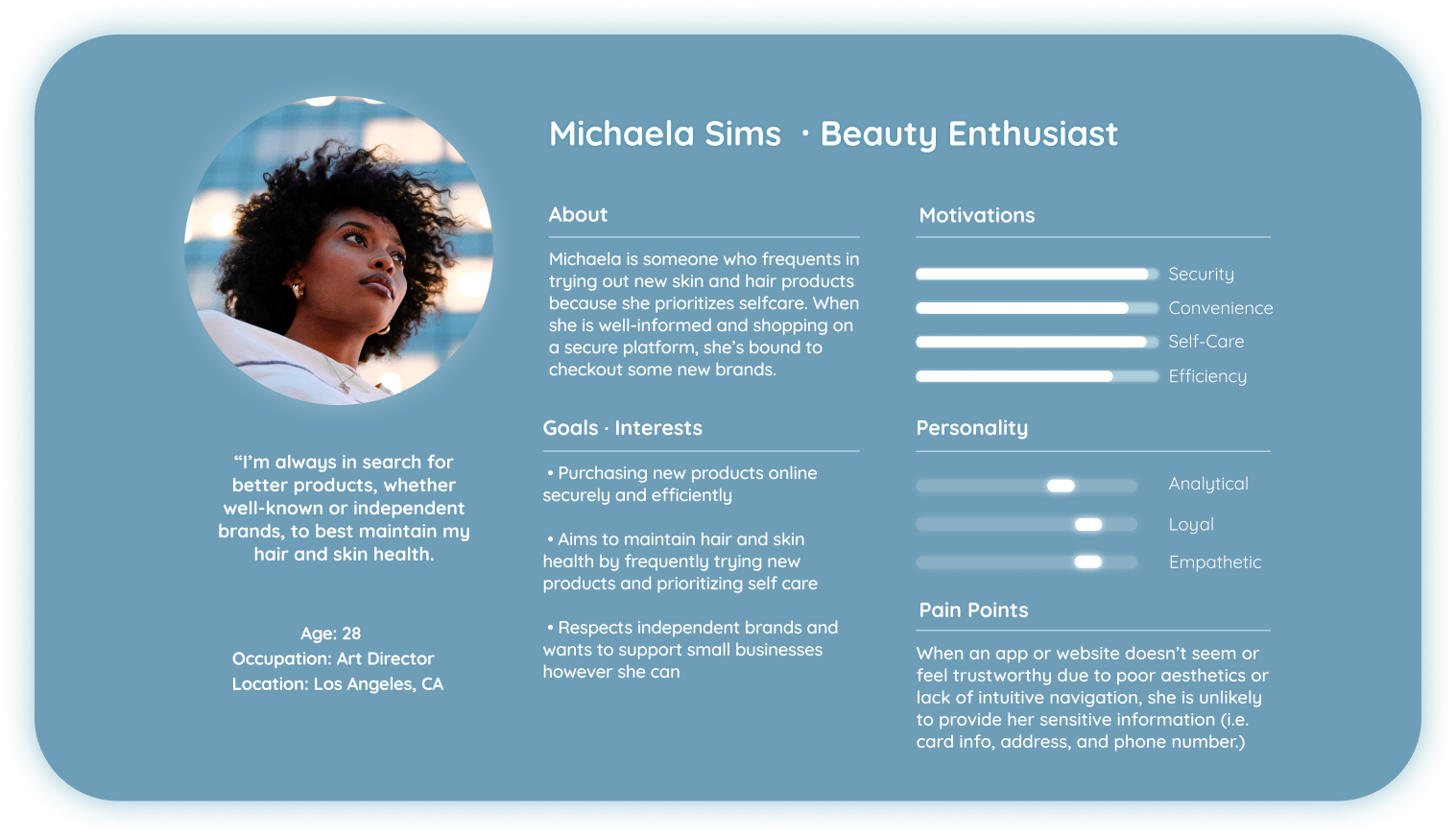
Persona
Professionalism in aesthetics and intuitive navigation are critical to fostering a sense of security and encouraging users to navigate the app successfully. To address this, I approached the design process with users and their pain points as the central focus. I created a user persona that encapsulated all the gathered data points, ensuring that her needs and experiences remained at the forefront throughout the design process.
__________________________________________________________
Problem & Solution Statements

__________________________________________________________
Sitemap
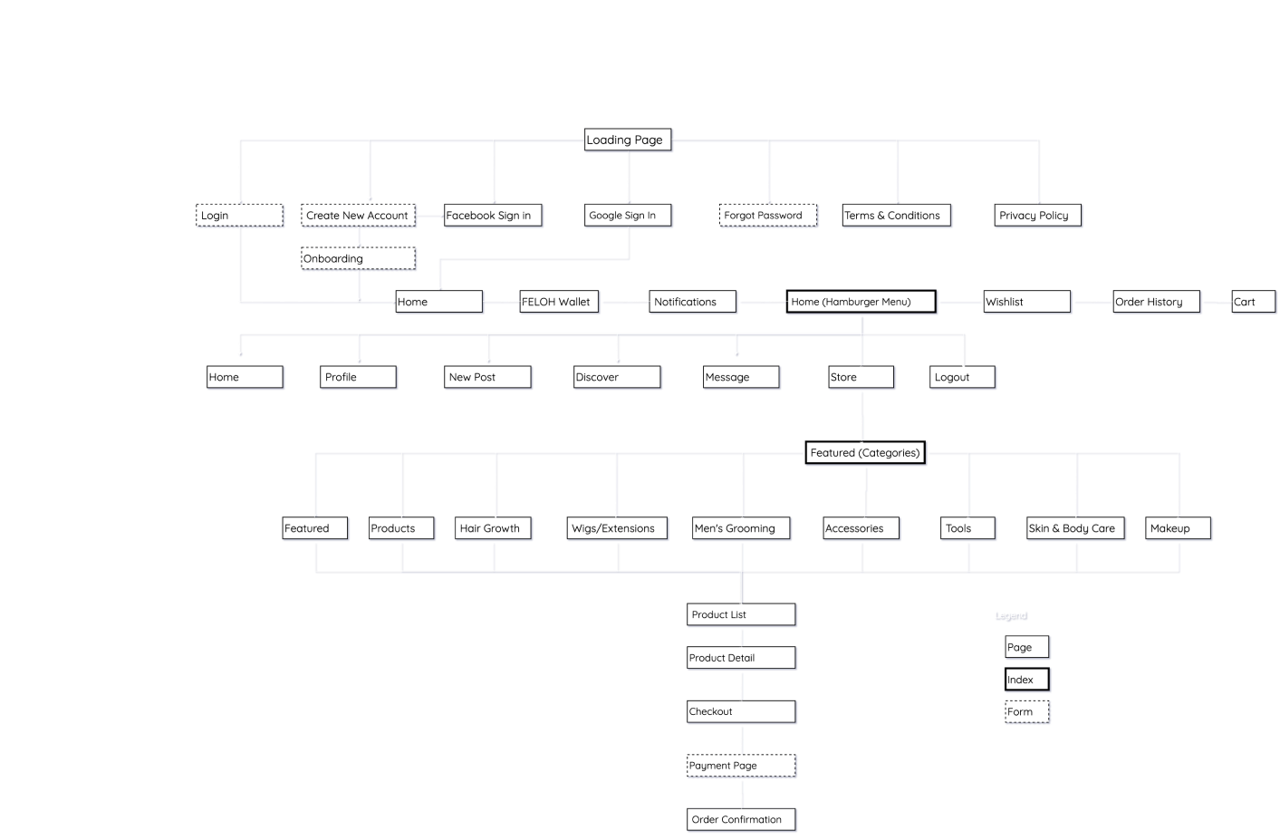
This process allowed me to pinpoint why the app was confusing for users and identify areas requiring improvement. I discovered the lack of subcategories, the oddly placed hamburger menu in the main navigation bar, and inconsistencies such as restricted access to features like profile and settings in the marketplace compared to the social side.
By analyzing the sitemap, I determined that the app needed better structure and organization to deliver an improved and seamless user experience.
__________________________________________________________
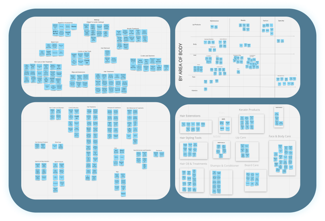
Open Card Sort
I conducted a card sorting exercise to gain insights into the ideal information architecture for an app like this. One significant issue with the app’s current structure was the lack of categorization; there were 184 unique products but only 9 categories to sort them into.
Given Feloh’s diverse range of products, I identified the need to create specific subcategories to help users navigate and find products more easily.
__________________________________________________________
Current User Flow
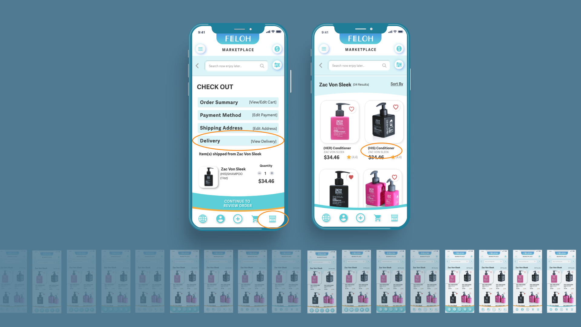
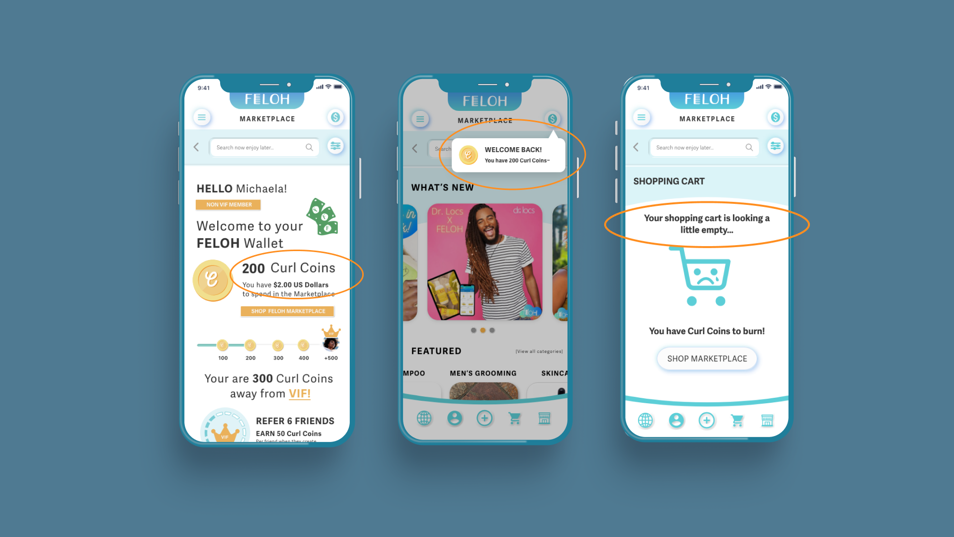
Upon opening the app, I observed that users had to take multiple steps just to check out an item. The current checkout process contains redundancies that make what should be a seamless experience unnecessarily difficult. While mapping out the user flow and testing the app, I noticed the absence of key features such as search and filter functionalities for products, which caused users to hit a dead end during checkout. Additionally, there is no option to apply a custom amount of Curl Coins to an order—users must either allocate all of their Curl Coins or none at all.
Another major issue I uncovered was the lack of an order review page after inputting payment information. This became evident when one of my teammates unintentionally ordered a bottle of shampoo while testing the app. This highlighted a critical gap: while the Feloh marketplace offers quality products and has strong potential, it lacks familiar features that would significantly improve the user experience and elevate the app to the next level.
__________________________________________________________
Design Start
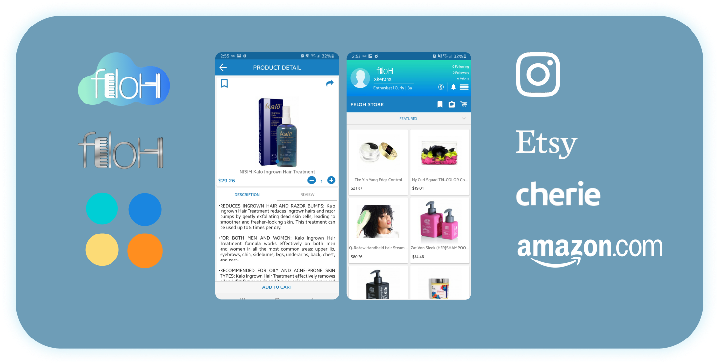
I gathered a collection of design inspiration to align with Camille’s vision for the app. She provided assets that served as valuable references, guiding the design process and influencing key elements such as layouts, imagery, and the color palette.
The brands highlighted in these assets featured core aspects that Camille wanted to incorporate into her app. I conducted research on these brands and other apps that excel in areas she prioritized, such as layout design, social integration, and security, to inform the direction of the redesign.
__________________________________________________________
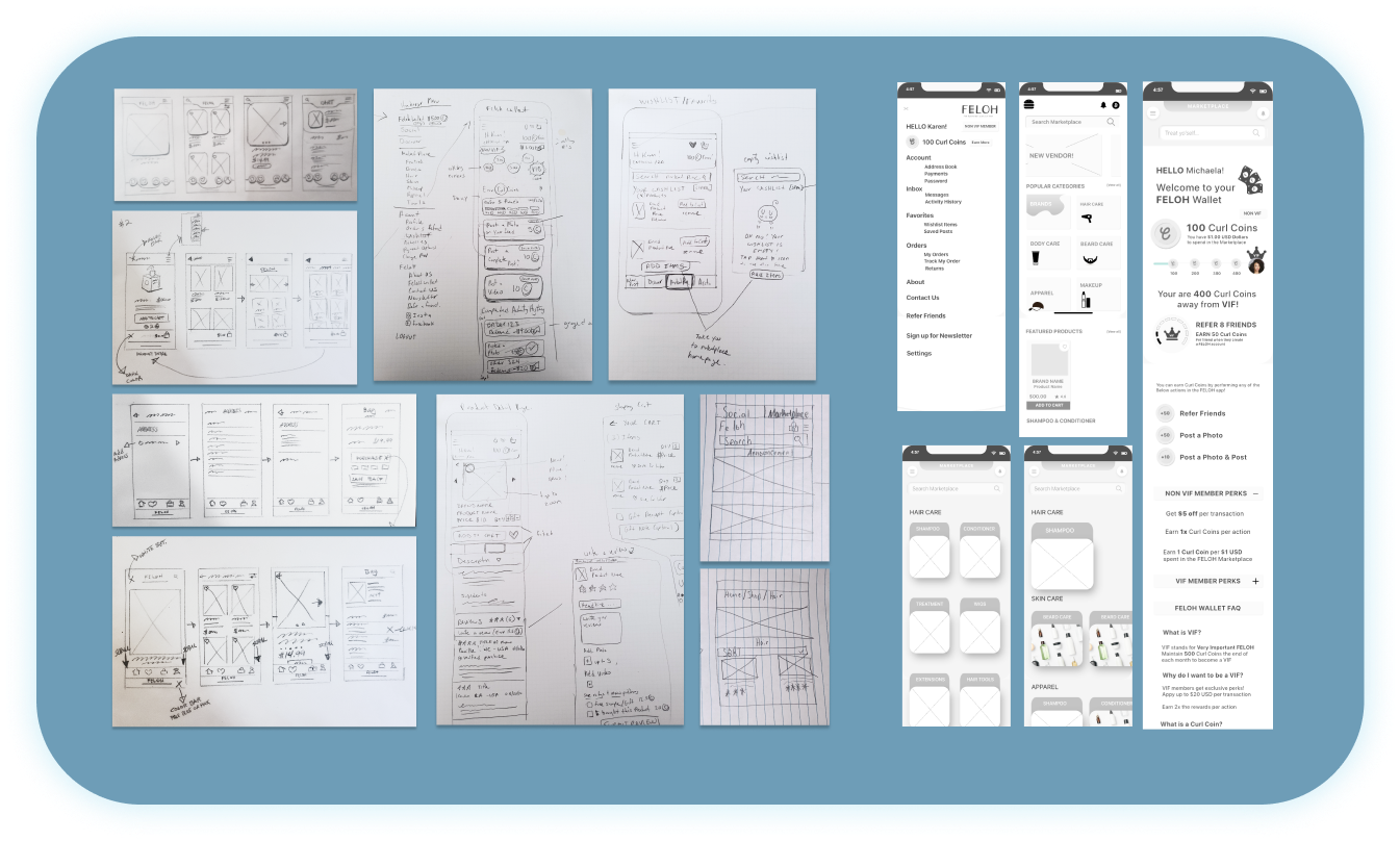
Sketches & Wireframes
Designing the initial sketches was an exciting and collaborative process. After receiving Camille’s approval for a complete app redesign, I was eager to translate ideas onto paper. I started by sketching concepts and then collaborated with the team to discuss and evaluate our designs. Together, we identified the most promising aspects to carry forward into the wireframing phase.
Once the grayscale wireframes were completed, I felt confident in the design direction and the mindset we had established, paving the way for more detailed and refined iterations.
__________________________________________________________
1st Design Evolution
Since our focus was on the Marketplace side of the app, I worked closely with the team responsible for the Social component to align on key navigation elements and their placement. This collaboration ensured that both teams were designing around a consistent screen layout and unified navigation system.
With the foundational research and exploration completed, I shifted focus to elevating one of the initial sketches to a higher level of fidelity in preparation for our first prototype. Keeping our persona in mind and considering Camille’s goal of appealing to a younger audience, I created potential start and product screens that would resonate with this demographic.
The first iteration of the design was a promising start and received positive feedback from Camille. However, through ongoing discussions with the team and Camille, we realized the design, while fitting for the health and beauty segment, didn’t fully capture the essence of the FELOH brand. These early conversations helped clarify important navigation and UI decisions that would shape the design moving forward.
__________________________________________________________
Prototype 1: Usability Test Summary
Recognizing that our design was nearly aligned with the brand, I made adjustments to the color palette to ensure a stronger brand match and created the first prototype for usability testing. The prototype included over twenty screens, designed to facilitate users in completing pre-determined tasks. The initial testing produced positive feedback, indicating we were on the right track, but it also revealed several usability issues and perceptions that weren’t aligning with our design goals.
While users appreciated the professional look of the design, there were concerns when they were asked who might use the app; answers such as "my parents" or "Facebook users" suggested that the design wasn’t appealing to the intended younger audience. Additionally, there were issues with flows, UX writing, and readability that needed refinement.
__________________________________________________________
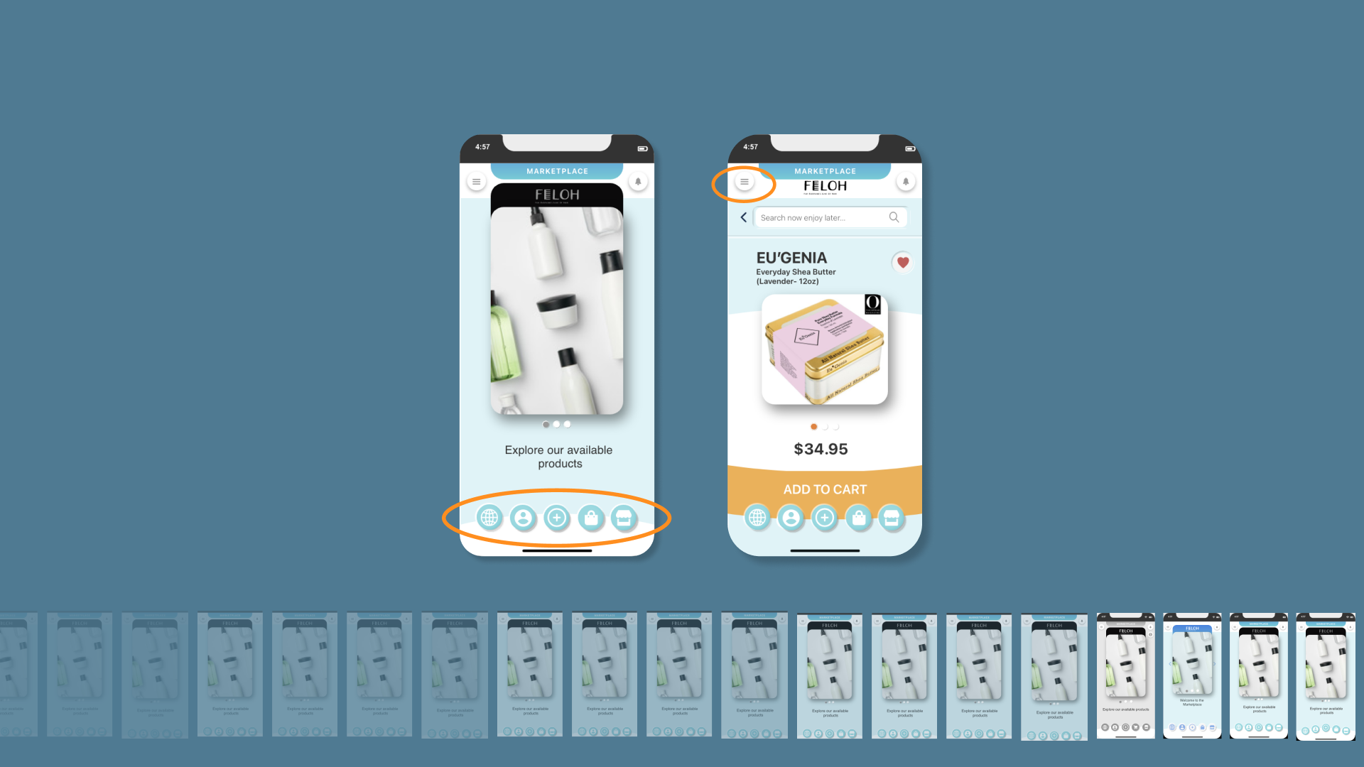
Prototype 2: Iterations
Using the feedback from usability testing, I developed an improved second prototype. This version featured a two-tone color palette and a more refined navigation bar—still prominent but subtle enough not to compete with the app’s content.
The second prototype saw a significant increase in screen count, now fully encompassing the necessary functionality and improvements. This allowed us to test the entire Marketplace experience, ensuring that the issues from the first prototype were addressed and that users could easily understand the app’s messaging and how it was intended to function.
__________________________________________________________
Prototype 2: Usability Test Results
We were pleased to find that test users in the second round reported very few usability issues, and we received feedback that differed significantly from the first prototype testing. Users described the app as fun to explore, with an easy-to-understand rewards system. When asked about the design, they no longer associated it with being a "Mom and Dad app." Instead, they described it as "fun," "trendy," "energetic," and "innovative."
This positive shift was a result of having clear goals and carefully analyzing the testing data. However, as with any design process, there were still areas for improvement that the second round of testing helped to uncover.
__________________________________________________________
3rd Design Iterations
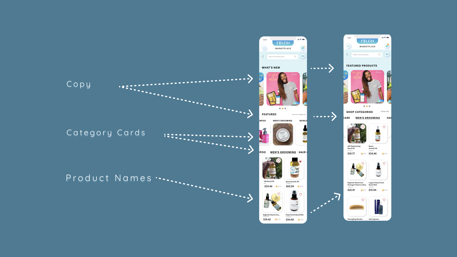
First, we updated the landing page copy from "What’s New" to "Featured Products" and changed "Featured" to "Shop Categories" in the second prototype. Users expressed that the original copy was too vague, leaving them unsure of their location within the app. By adding more familiar terms like “products” and “shop,” we aimed to clearly signal to FELOH users that they were in the marketplace and ready to use their Curl Coins.
Secondly, we tested a vertical scroll on the featured category cards, but users became confused by the proximity of both vertical and horizontal scrolling elements, compounded by seeing duplicate product category titles. The category images being the same size as the product images also added to the frustration. As a result, we pivoted and removed the vertical scroll feature for now.
With the category images removed, we were able to bring the products up on the page, allowing users to see products sooner and prompting them to begin shopping.
Lastly, we addressed a usability issue related to product names. Initially, we only had one line for product names, but longer titles were being cut off, frustrating users during testing. To resolve this, we added a second line for product names to ensure all information was visible and easily readable.
__________________________________________________________
Future Sitemap
This is our proposed future sitemap for the FELOH Marketplace.
As mentioned earlier, there were certain functions within the app that could only be accessed on the social side, and vice versa. By removing the main navigation from the collapsible hamburger menu, I was able to combine these critical functions, ensuring that users could easily access them regardless of whether they were in the marketplace or on the social side of FELOH.
Additionally, with the implementation of a search bar, filter and sort options, and the creation of subcategories for main product categories, these improvements have resulted in a more streamlined and user-friendly sitemap.

__________________________________________________________
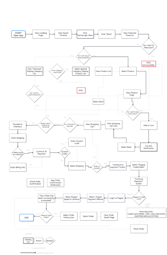
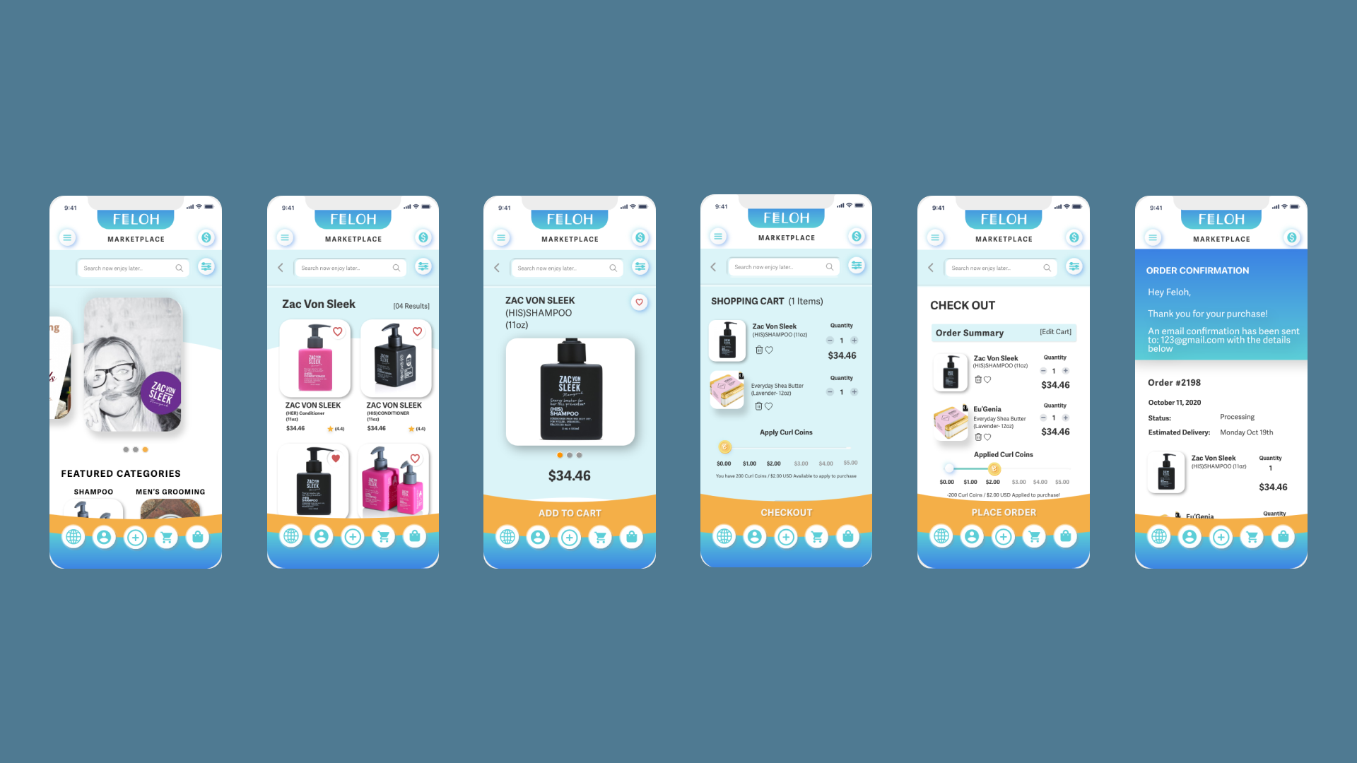
Updated User Flows

This is the updated user flow for how Michaela will now purchase a product on the redesigned FELOH app.
We streamlined the process, reducing the flow from 35 to 25 steps by eliminating unnecessary screens. However, we also added some new steps to provide users with more options for searching and discovering products within FELOH.
One key improvement is the addition of an order review page, ensuring users have a chance to review their selections before completing the purchase, preventing accidental orders.
__________________________________________________________
Prototype
__________________________________________________________
Next Steps