Truist Cyber Insights
I led UX for a suite of cybersecurity dashboards for Truist's CCS Data Intelligence team, turning thousands of compliance signals into views that executives, risk officers and SOC analysts could actually act on.
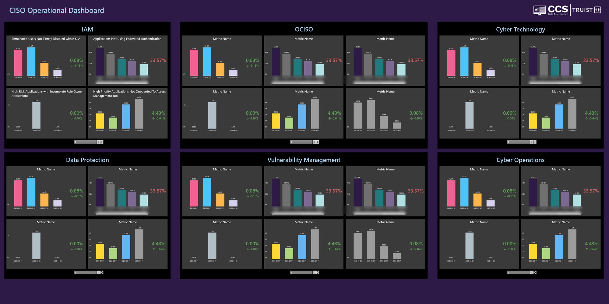
Security data was everywhere. Answers weren't.
Truist's cyber teams tracked hundreds of metrics: endpoint coverage, scanning, privileged access, data loss prevention, incident response, resilience testing and more. The data lived in Tableau, fed by tools like ServiceNow, Veracode and Archer. But each team read it differently, and leaders couldn't see the big picture without asking someone to pull a report.
I was the UX lead on the IBM side. Much of my design work was proofs of concept showing that each dashboard could really be built in Tableau, where the data already lived. The other half of the job was people: working directly with Truist stakeholders to lock requirements, keep reviews moving and get every dashboard to engineering on time and complete.
Many audiences, many metrics, one source of truth.
A CISO wants to know where the bank is exposed this month. A BISO wants to know which of their applications are failing. A SOC analyst wants to know how fast threats are being caught. Same data, very different questions.
Every metric, its own report
Teams built one-off views, so the same number could look different depending on who made the dashboard.
Hard to see who owns what
Compliance only moves when people know it's theirs. Owners (BISO, DCIO, BISM, business unit) weren't easy to filter to.
Would it work in Tableau?
Ideas had to be buildable on the existing Tableau stack and real data model, not just look good in a mockup.
Give every audience a dashboard that answers their question in seconds, built from one consistent system that engineers can ship in Tableau.
How might we turn hundreds of security metrics into clear signals that show what's out of compliance, who owns it and what's coming due?
Design the dashboard. Prove it in Tableau. Ship it.
My job sat between the client and the build team. I ran requirements with Truist, turned them into wireframes, proved each one could be built in Tableau, then handed engineers a spec they could build without guessing.
Worked directly with Truist's cyber and risk leaders to set priorities, lock requirements and keep reviews on schedule.
Built dashboards as Tableau-ready designs, using real fields and filters, so every idea was proven buildable before engineering started.
A shared layout, filter rail, color logic and header meant new metrics dropped into a familiar shape. That cut inconsistencies in half.
Posture across domains, what's out of compliance and for how long.
Their applications, their gaps, filtered to their name.
Case volume, closure rate, and time to detect and contain.
Processes, risks, controls, findings and remediation in one chain.
Intake
Metric, owner and audience with Truist leads
Requirements
Fields, filters, goals and thresholds
Wireframes
Layout on the shared template
Tableau POC
Prove it works on the real data model
Review
Stakeholder sign-off, all requirements met
Hand-off
Engineers build to spec, on time
One template. Dozens of metrics.
Most metrics answer the same four questions: how bad is it, where is it, who owns it and is it getting better? So I designed one standard template that any metric could plug into. Teams stopped reinventing layouts, and leaders learned to read every dashboard the same way.
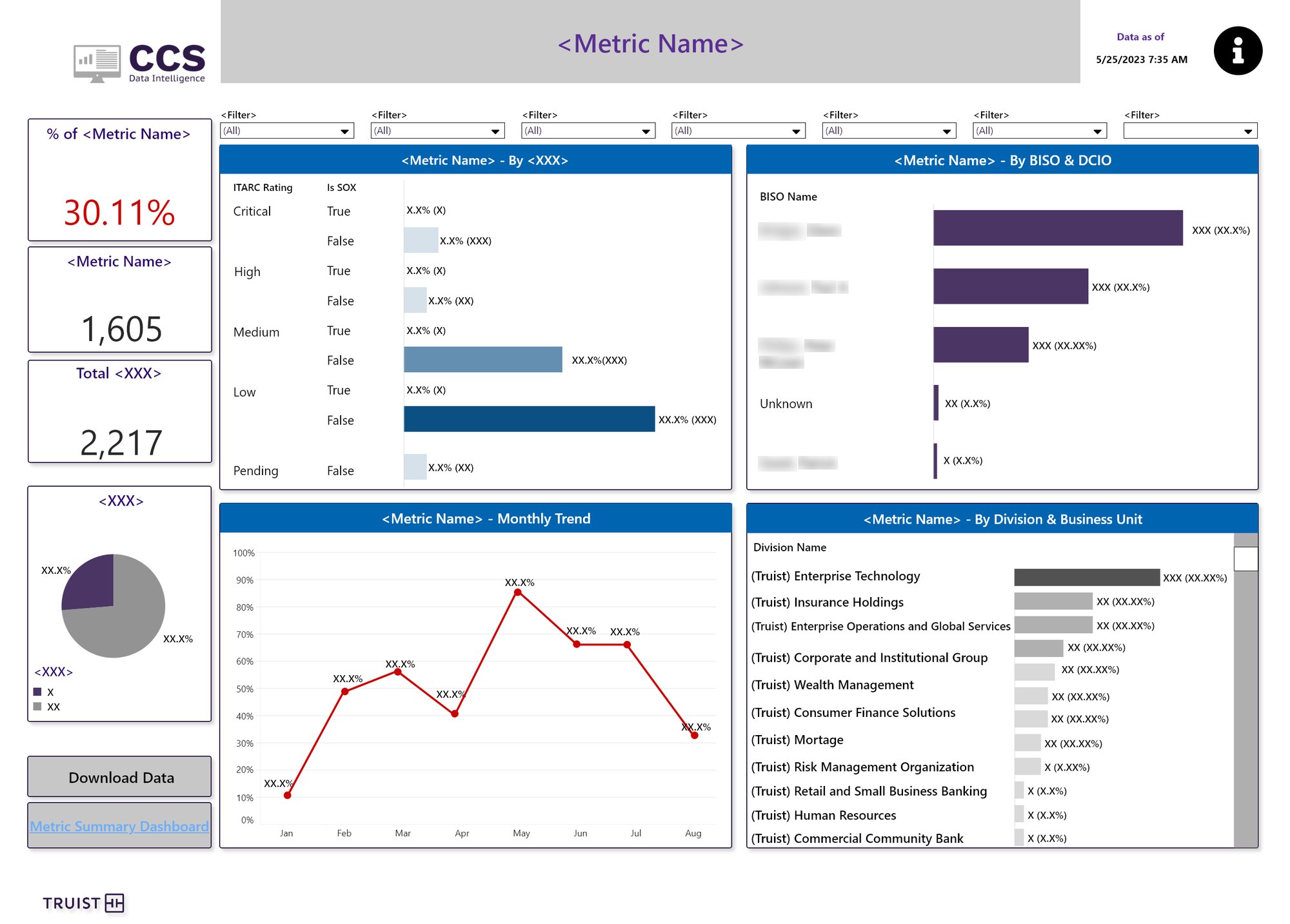
- Headline numbersPercent and count on the left rail, readable at a glance.
- Filters on topSame order on every dashboard: owner, division, business unit, date.
- By risk ratingITARC rating and SOX flag show where the exposure matters most.
- By ownerBISO and DCIO bars make accountability visible.
- Trend + divisionMonthly trend and a breakdown by business unit close the loop.
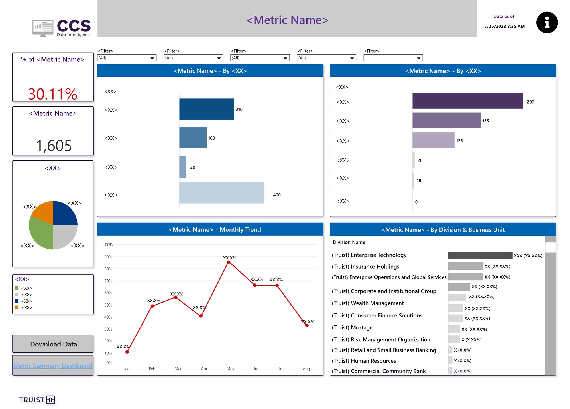
The same template applied to a data loss prevention metric. Only the content changes.
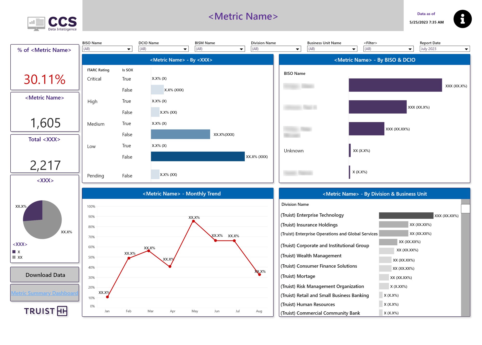
A report-date filter turns the live dashboard into a monthly snapshot for leadership reviews.
From the CISO's desk to the SOC floor.
Each dashboard was built for one audience and one main question. Here's the suite, grouped by who uses it.
Where are we exposed, right now?
The CISO Operational Dashboard puts six domains (IAM, OCISO, Cyber Technology, Data Protection, Vulnerability Management, Cyber Operations) on one screen. The CCS Metric Summary goes deeper: every metric, its goal, how long it's been out of compliance and how each business area is doing.
A dark, wall-screen friendly layout. Each domain shows its key metrics with the current value and the change since last month.
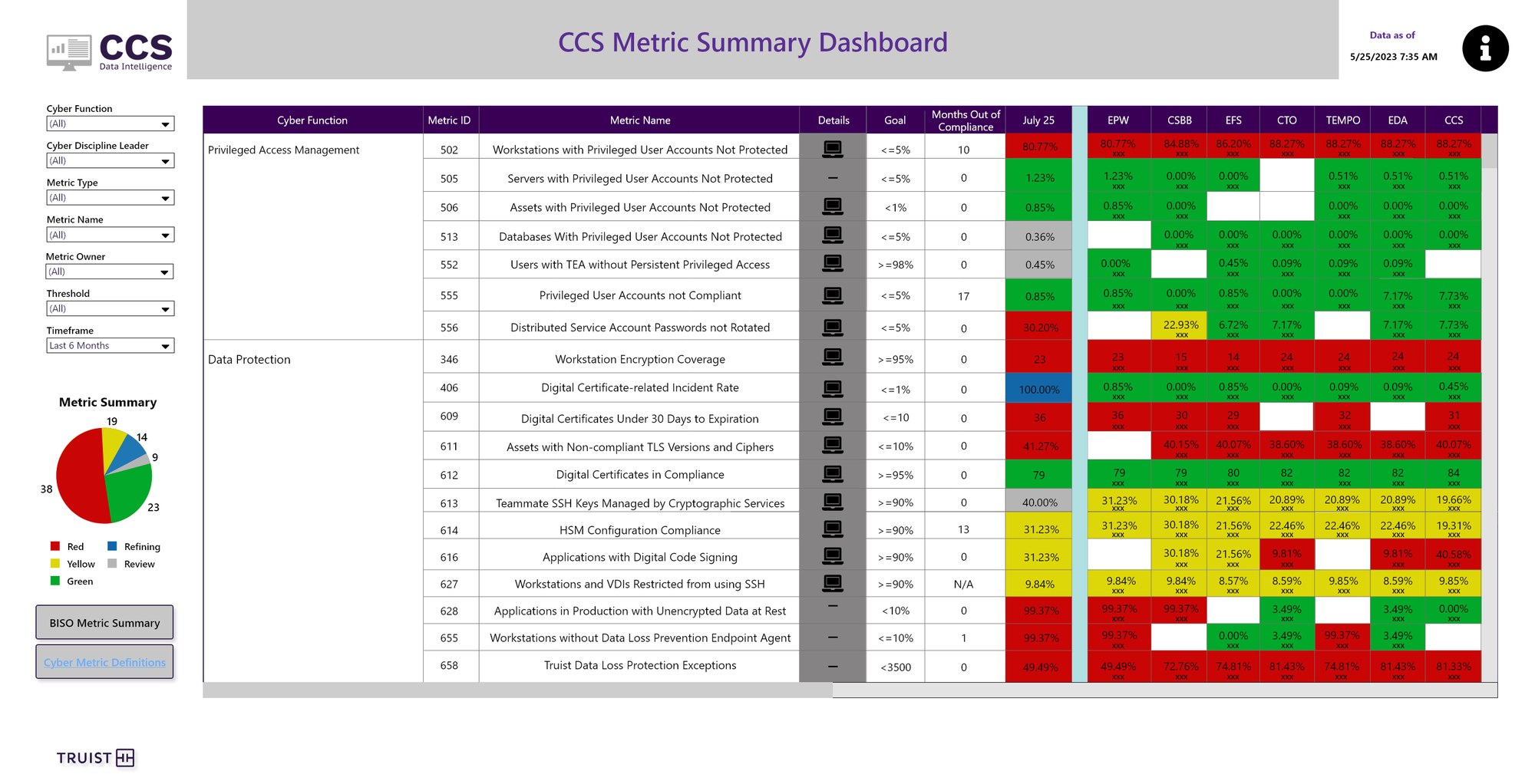
Red, yellow and green by business area, with "months out of compliance" so leaders can see what's been stuck the longest.
Grouped the way the CISO's org is structured, so every leader finds their area immediately.
Every number comes with its month-over-month change, so a value is never shown without context.
"Months out of compliance" turned a status into an escalation signal.
How fast are we catching threats?
The SOC & CIRT dashboard tracks case volume, closure rate and mean time to detect, acknowledge and contain. A dedicated Mean Time to Detect view breaks detection time into buckets and compares all events with confirmed true-positive incidents.
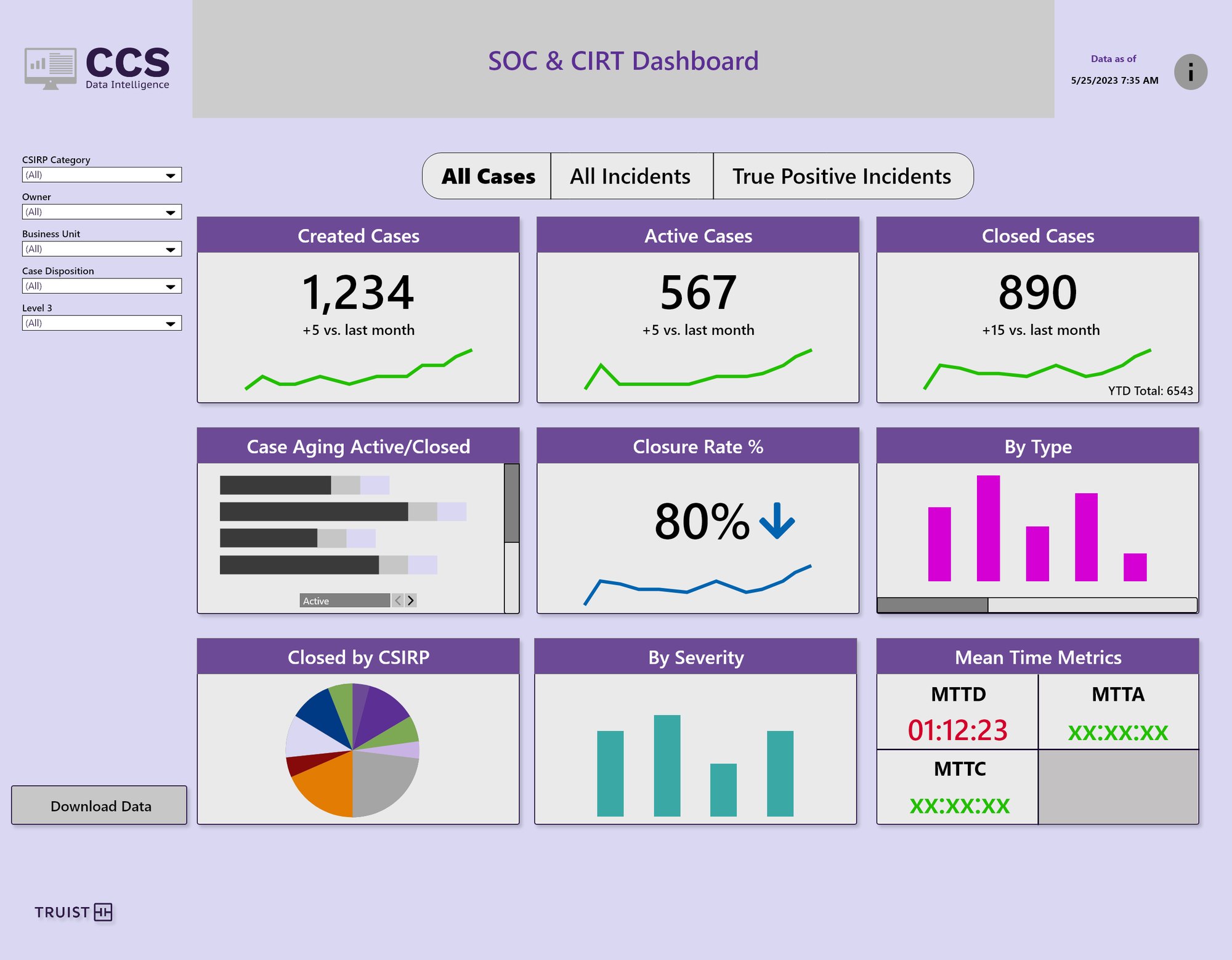
All cases, all incidents or true positives only, one toggle away.
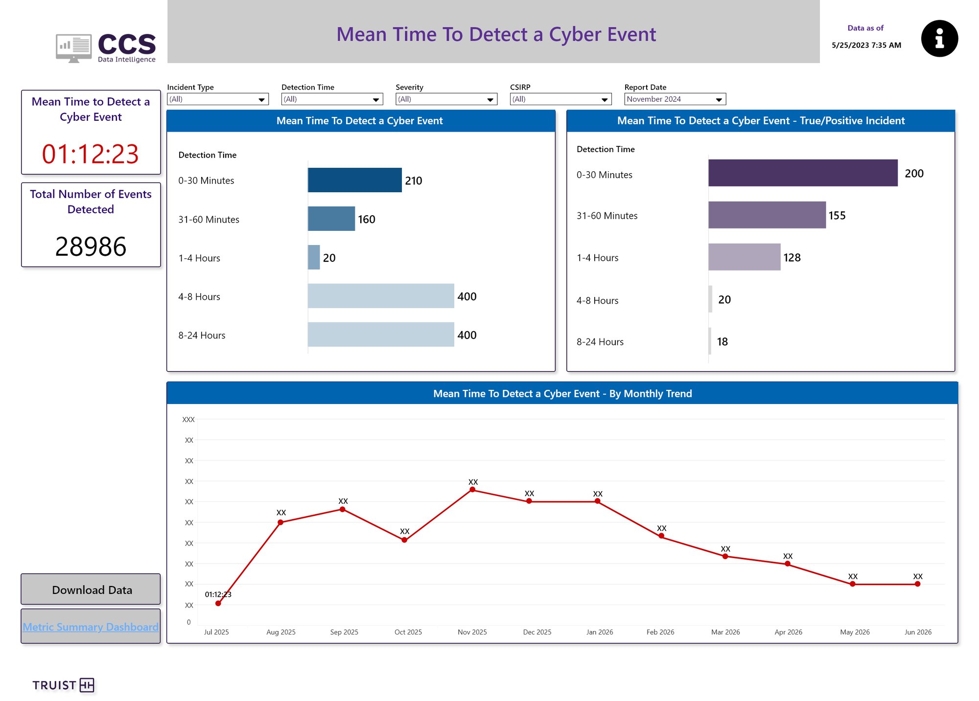
Detection time buckets side by side for all events and true positives, plus a 12-month trend.
Created, active and closed cases sit at the top with a sparkline and a monthly comparison.
Separating real incidents from noise made response times honest.
Teams could spot slow detection buckets quickly. Incident response got 20% faster.
Is every server and app protected?
Endpoint Coverage shows how many servers each security tool (Tanium, antivirus, CrowdStrike, SEP) covers, trended by risk rating. Application Compliance gives each app a single scorecard: 23 requirements, red or green, with plain-language definitions next to every one.
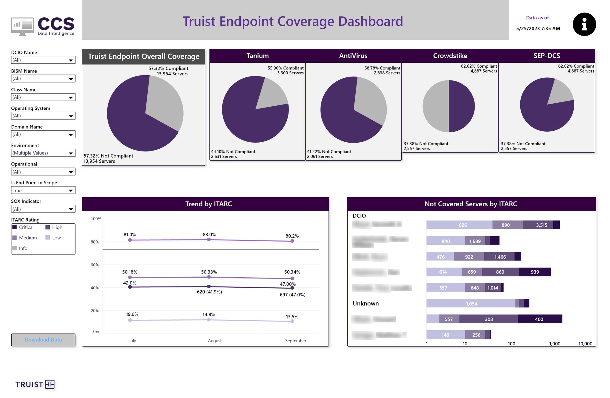
Overall coverage, then one pie per tool. Not-covered servers are broken down by owner and risk rating.
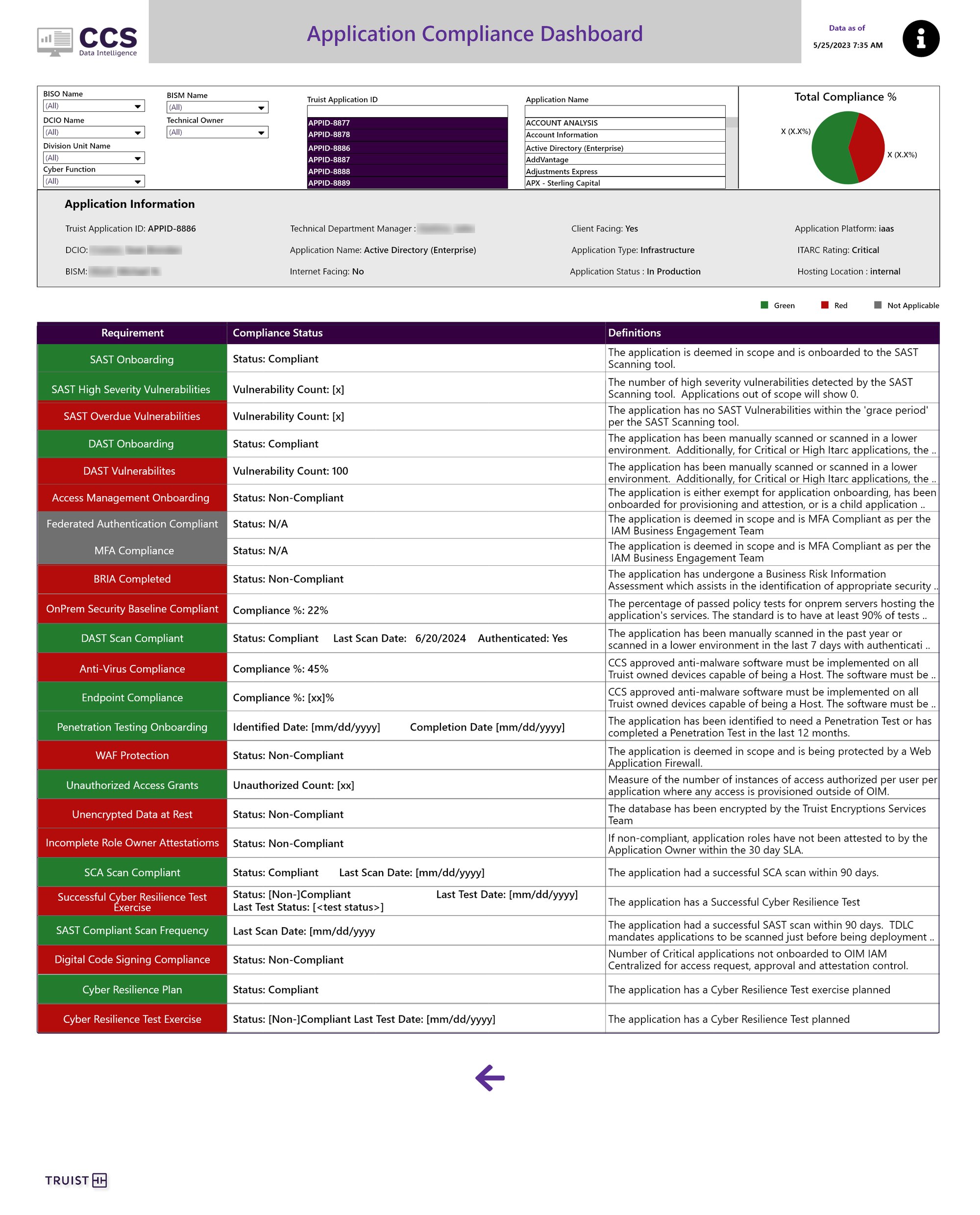
Scroll inside the frame. Pick an app and every requirement shows its status, its value and what it means.
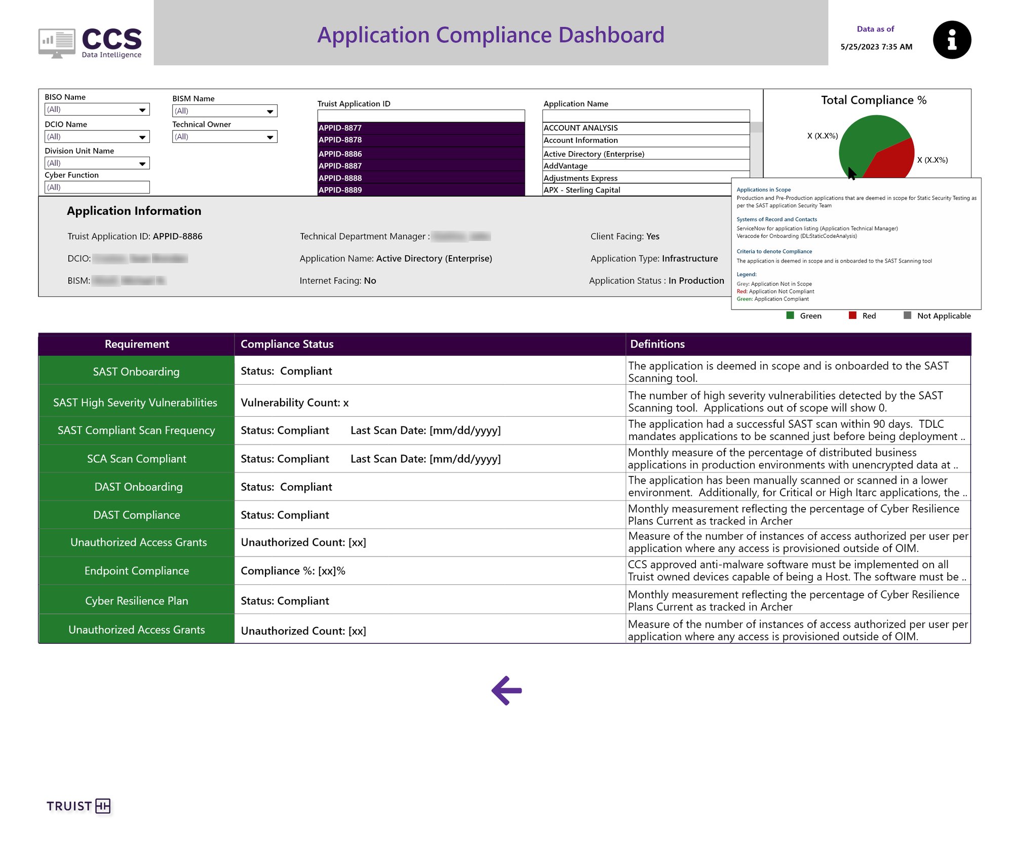
Info tooltips explain scope, source systems and the exact criteria for compliance.
Every requirement explains itself right on the row, so nobody has to look up a policy doc.
Owners, platform, risk rating and hosting are pinned above the scorecard.
Coverage per tool shows exactly which agent is missing, not just that something is.
Follow a risk all the way to its fix.
The Process, Risks & Controls dashboard connects the full governance chain: business processes, risks, controls, findings, remediation items, metrics and policies. A home view summarizes by InfoSec tower, and each count opens a detail view with a second level for the deeper fields.
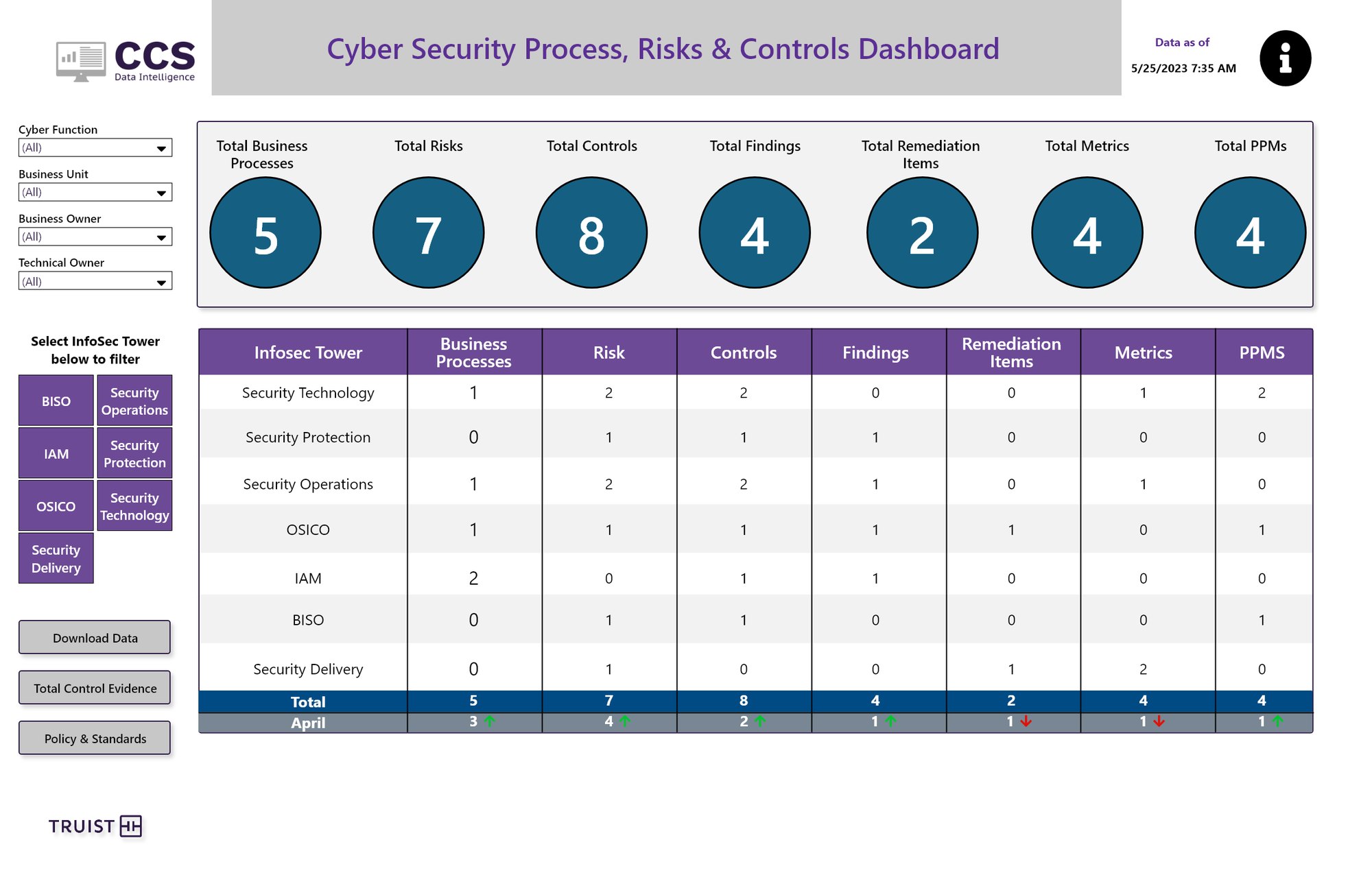
Seven totals across the top, then a tower-by-tower breakdown with month-over-month change.
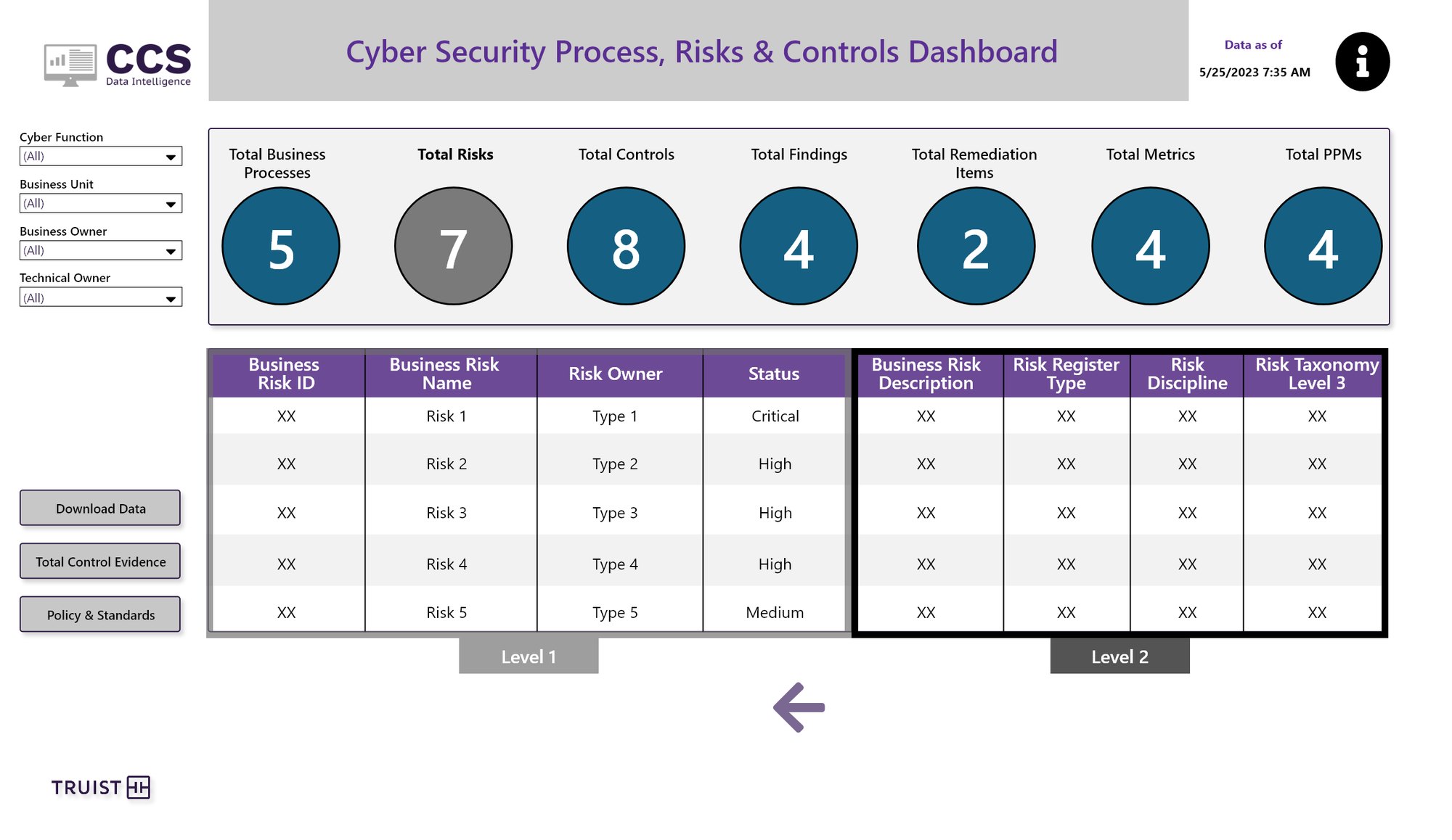
Level 1 shows the essentials. Level 2 adds description, register type, discipline and taxonomy.
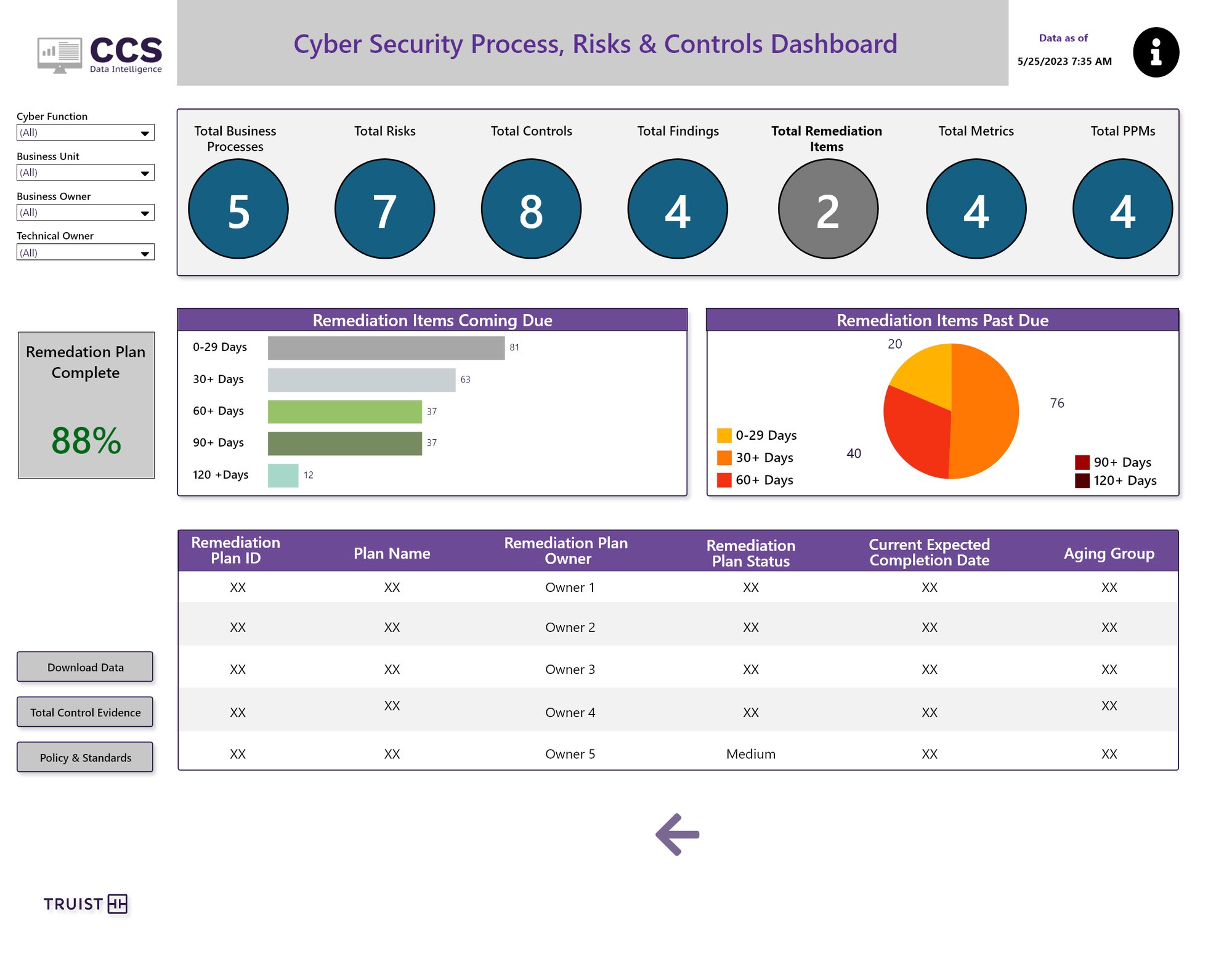
Items coming due and past due by age, plus overall plan completion.
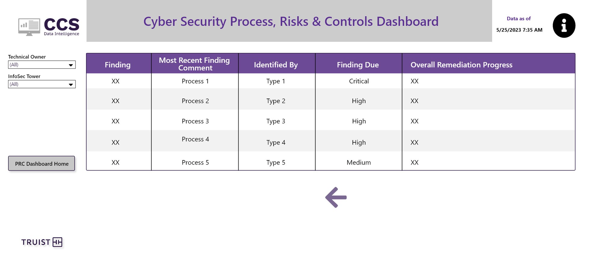
Detail views keep a clear path back to the PRC home.
Clicking a total opens that view, and the active total turns grey so you always know where you are.
Level 1 for scanning, Level 2 for audit-grade detail, without crowding one table.
Remediation is grouped by days past due, which is what drives escalations.
From the whole portfolio to one login.
Shared User & Service Account Compliance starts with total compliance and owners, then drills into one application down to each account's vaulting, verification and password rotation. Wire System Security Governance tracks adherence across the bank's wire applications.
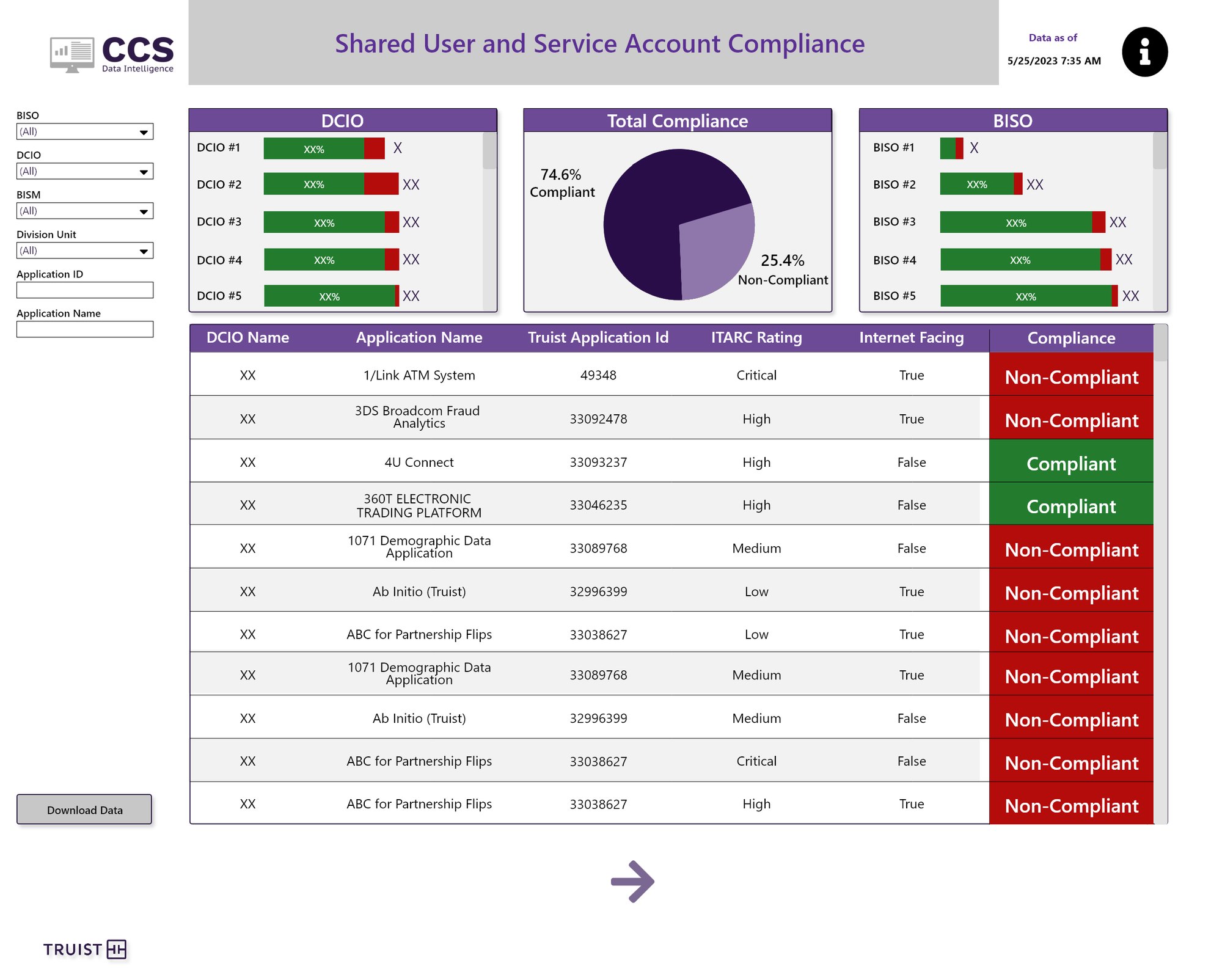
Compliance by DCIO and BISO on either side of the overall split, with an app-level table below.
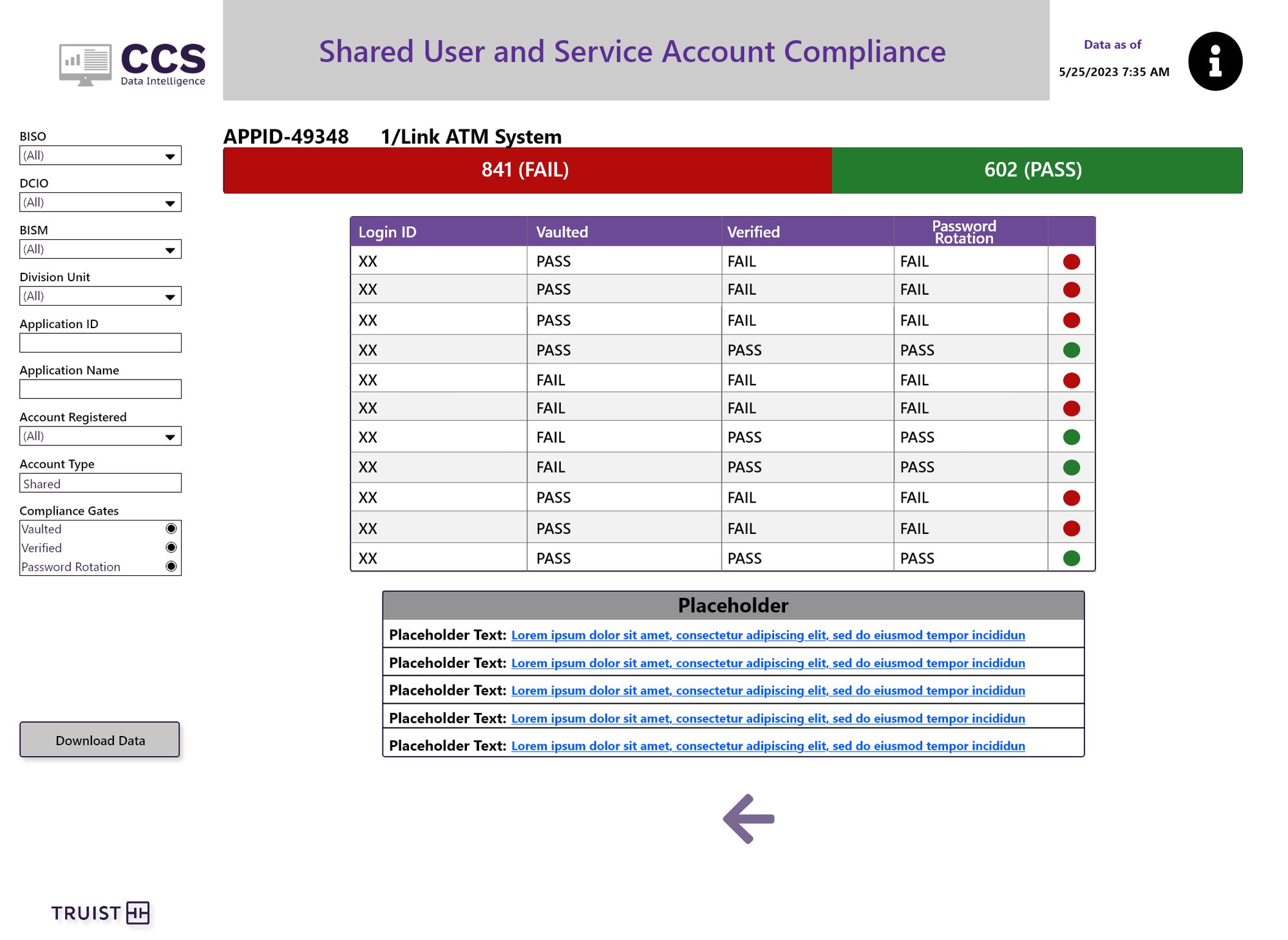
For one app, each login is checked against three compliance gates.
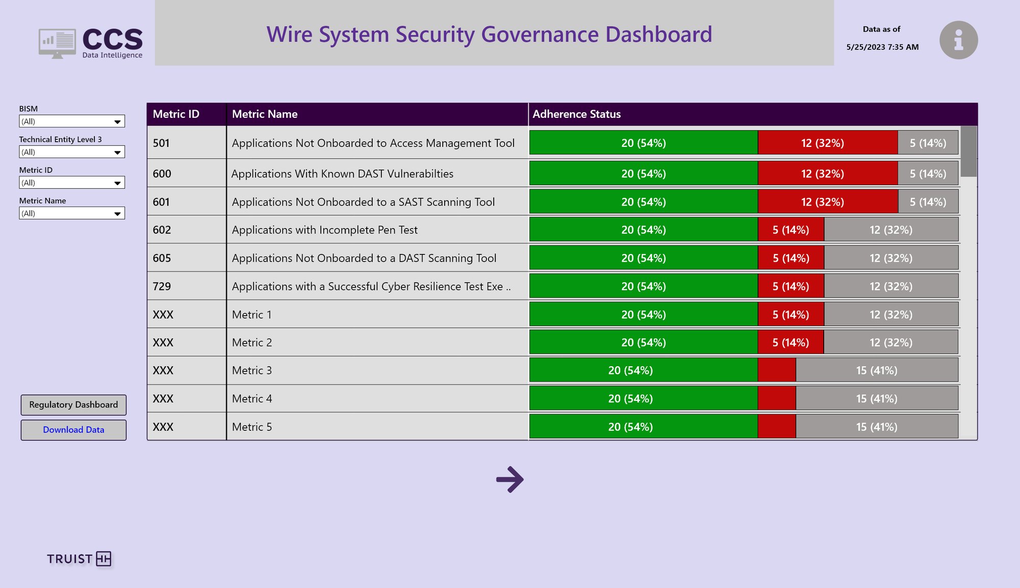
Adherence for each metric as a single stacked bar: compliant, non-compliant, not applicable.
Portfolio, application, account. Each step answers the next obvious question.
Pass or fail on each gate makes the fix obvious to an app owner.
Stacked adherence bars made a long list comparable in one glance.
Keep commitments from slipping.
The Cyber Testing & Application Resilience Planning dashboard tracks resilience plans and tests across critical apps, month by month. Cyber Sub-Issues shows what's past due, what's coming due and which drafts are stalled.
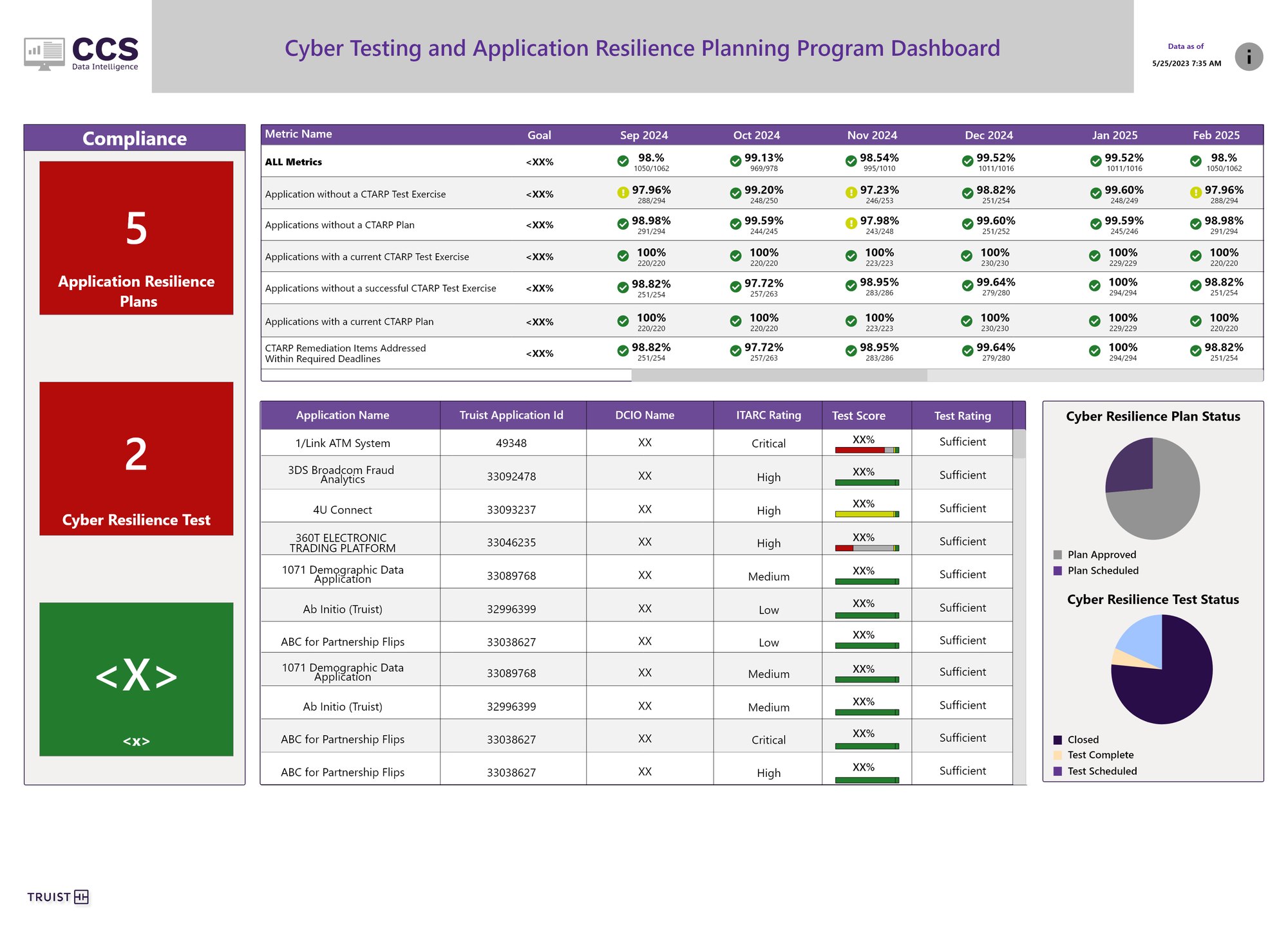
Monthly results against goal with check and warning icons, so status never relies on color alone.
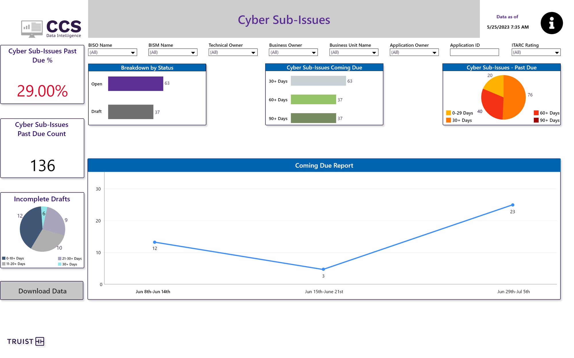
Past-due rate and count up top, then status, aging and a weekly coming-due report.
What I learned, and what I'd do next.
Takeaways
- 01Feasibility is a design skillProving each idea in Tableau early meant no surprises at build time, and faster iteration overall.
- 02A template is a productThe shared layout did more for consistency than any single dashboard. It cut inconsistencies in half.
- 03Managing people is the jobClear requirements and steady stakeholder reviews were what got dashboards out on time.
If I took it further
- →Lead with exceptionsShow what's out of compliance first, instead of 24 equal charts.
- →Never rely on color alonePair red and green with icons and labels everywhere, like the resilience dashboard does.
- →Plain-language summariesAn AI-written "what changed this month" note at the top of executive views.
The numbers that mattered
20% faster, with clearer SOC and detection views.
50% fewer inconsistencies across dashboards.
25% faster iteration and 25% shorter redesign timelines.
35% higher satisfaction and a 30% rise in phishing reporting.