IBM · Case study · Public health SaaS

Community Health 360

I led the redesign of IBM’s Community Health 360 in 2022. Here I revisit that work: the same problem and the same real-world results, with the key screens pushed further.

My roleUX + UI, visual design, branding, user flows, research, prototyping, testing
TimeframeDec 2022 – Jan 2023
PlatformResponsive SaaS, mobile-first, member + provider portals
ToolsAdobe XD, Mural, Zoom, Google Forms, Excel, Slack
ibmch.com/dashboard/well-being
IBMCommunity Health
Find supportMy dashboardMap
Zena
Hi Zena, here's where things stand
Last check-in Oct 10 · 12 days ago
Check in now · 5 min
Needs attention
6 areas
Housing is most urgent
Getting by
2 areas
Transportation, Employment
Doing well
3 areas
Health, Financial, Dependent care
Start hereSorted by priority
AreaHow you feelWho's helpingNext step
HousingNot okayHappy HomesWaiting on youRespond
IncomeNot okayFinance TeamThu at 2:00 pmView
FoodNot okayNutritious & DeliciousUpdated 12 days agoUpdate
SafetyNot okayCommunity SafetyNo contact yetFind help
EducationNot okayBright FuturesIntake in reviewView
SocialNot okaySunday SocialsEvent this SundayRSVP
Doing fine: HealthDependent careFinancialTransportationEmployment
Meet ZenaZena Way, 32Juggling housing, food and income needs. Every screen below follows her.
NoteThe impact numbers and Hope Florida rollout come from the shipped 2022 design. The screens marked Redesign are my 2026 revisit. Flip any of them to Original to see what shipped.
00Overview

A front door to local help, built to grow.

Community Health 360 connects people with local services like housing, food, transportation, and health care. The original platform worked, but it was hard to use. Navigation was disorganized, it didn't hold up on phones, and a lot of mobile visitors dropped off before finding what they needed.

I partnered with IBM's product and engineering teams to redesign it as a responsive, mobile-first SaaS platform. I rethought the navigation, simplified the core workflows, and built patterns that could scale, so the same product could serve community members, care providers, and whole state programs.

−40%time spent searching for a resource
+35%engagement across devices
+50%resource discovery
01The challenge

People needed help. The platform made them work for it.

The people using Community Health 360 are often dealing with something hard, like an eviction notice, an empty fridge, or a ride they can't get. Most of them were on their phones. The old experience asked too much of them at exactly the wrong moment.

01 / Cluttered

Hard to find anything

Disorganized navigation and inconsistent patterns meant people had to hunt for the resource they came for.

02 / Mobile

Broke on phones

Mobile users made up most of the audience, but the layout wasn't responsive. That caused steep engagement drop-offs.

03 / Scale

Couldn't grow cleanly

Stakeholders needed to add programs, providers, and features without breaking the experience every time.

Objective

Design a mobile-first, responsive platform that makes it effortless to discover and access community resources, and that can keep growing.

How might we

How might we help someone go from "I need help" to "someone's helping me" in as few steps as possible, on any device?

02Approach

Scalability was a design requirement, not just an engineering one.

The platform serves a growing, diverse audience and keeps taking on new programs, referrals, and check-ins. Every pattern I designed had to handle more data, more providers, and new features without people having to relearn anything.

One flexible design system

Shared components for cards, tables, status pills, and forms, so new features drop into familiar shapes.

Responsive architecture

Designed mobile-first, then scaled up to tablet and desktop, so the experience holds together on whatever device someone has.

Modular dashboard

The 360 Dashboard is a set of modules (well-being, care team, requests, history) that can be added, removed, or rebranded per program.

Community members

Find and get help

  • Search local services by need and zip code
  • Check in on how life is going
  • Self-refer into programs
  • Track requests and see their care team
One
platform
Providers & organizations

Deliver and coordinate it

  • Digital intake instead of paper forms
  • Search and manage connected members
  • See referrals and service requests in real time
  • Spot community-wide trends
01
Discover

Search services by need and location

02
Sign up

Quick, secure account setup

03
Check in

Share how 11 areas of life are going

04
Self-refer

Get matched to the right programs

05
360 Dashboard

Track progress, team, and requests

06
Provider portal

Intake, triage, and follow-up

06The design, revisited

Same system. Sharper decisions.

Looking back with fresh eyes, the original screens did their job, but many of them asked people to read a lot before they knew what to do. For this revisit, every screen had to answer one question first: what should I do next?

IBMCommunity Health
IBMCommunity Health
New brand mark

A heart inside an open 360° ring. The ring is the full view of a person's life, and it stays open because care is ongoing. The yellow dot marks where you are now. A pulse line runs through the heart for health.

Illustrated people

Zena, the member, and Melissa, a case manager, replace stock photos, so the product feels warm without featuring real people.

06.1 — First check-in (mobile)

Set expectations, then ask.

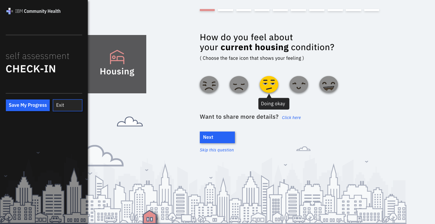
The original check-in jumped straight into questions. The revisit tells people how long it takes and what they get back, shows a privacy promise up front, and ends with a short snapshot that points to one next step.

9:41
IBMCommunity Health
Let's find the right help for you.
A quick check-in matches you to local services.
111 short questions, about 5 minutes
2See services matched to your answers
Private by default. You choose who sees it.
Start check-in
Just browse services
9:41
‹ Back3 of 11Save & exit
Housing
How do you feel about your housing?
Not doing so well
Getting by✓
Fine overall
Pretty good
Really good
+ Tell us more (optional)
Next
9:41
Thanks, Zena. Start here.
Housing
12 nearby
Not okay
Food
9 nearby
Not okay
Income
5 nearby
Not okay
+ 8 more areas · See all
First check-in badge
+50 wellness points
See housing matches
Before → AfterExplain the deal first

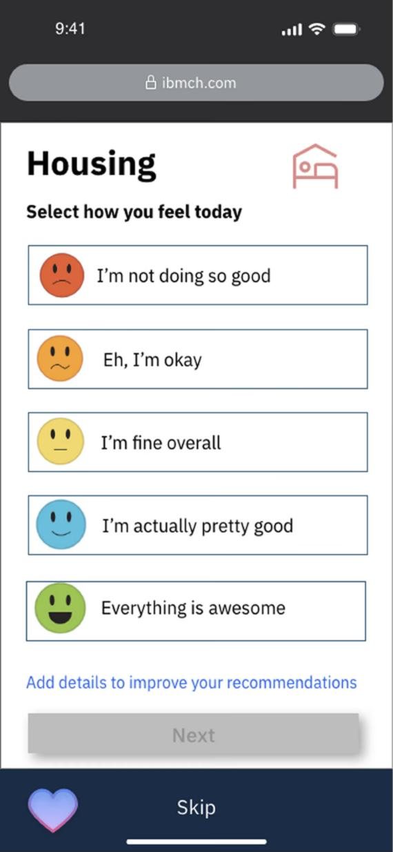
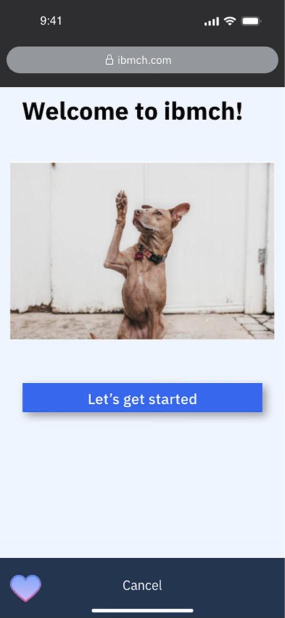
A dog photo and "Let’s get started" became: 11 questions, about 5 minutes, and services matched to your answers.

Before → AfterProgress you can see

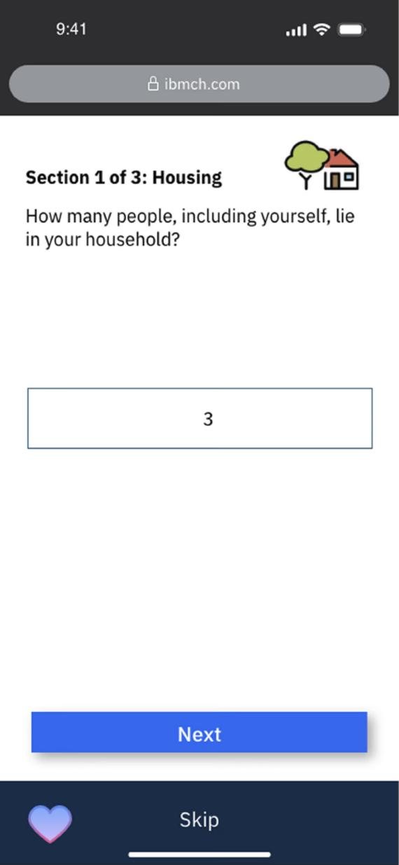
"Section 1 of 3" became a real progress bar with Back and Save & exit always visible.

Before → AfterA payoff at the end

Instead of dropping people into a dashboard, they get a 3-item snapshot and one clear button.

06.2 — Well-being overview

From an 11-row table to "start here".

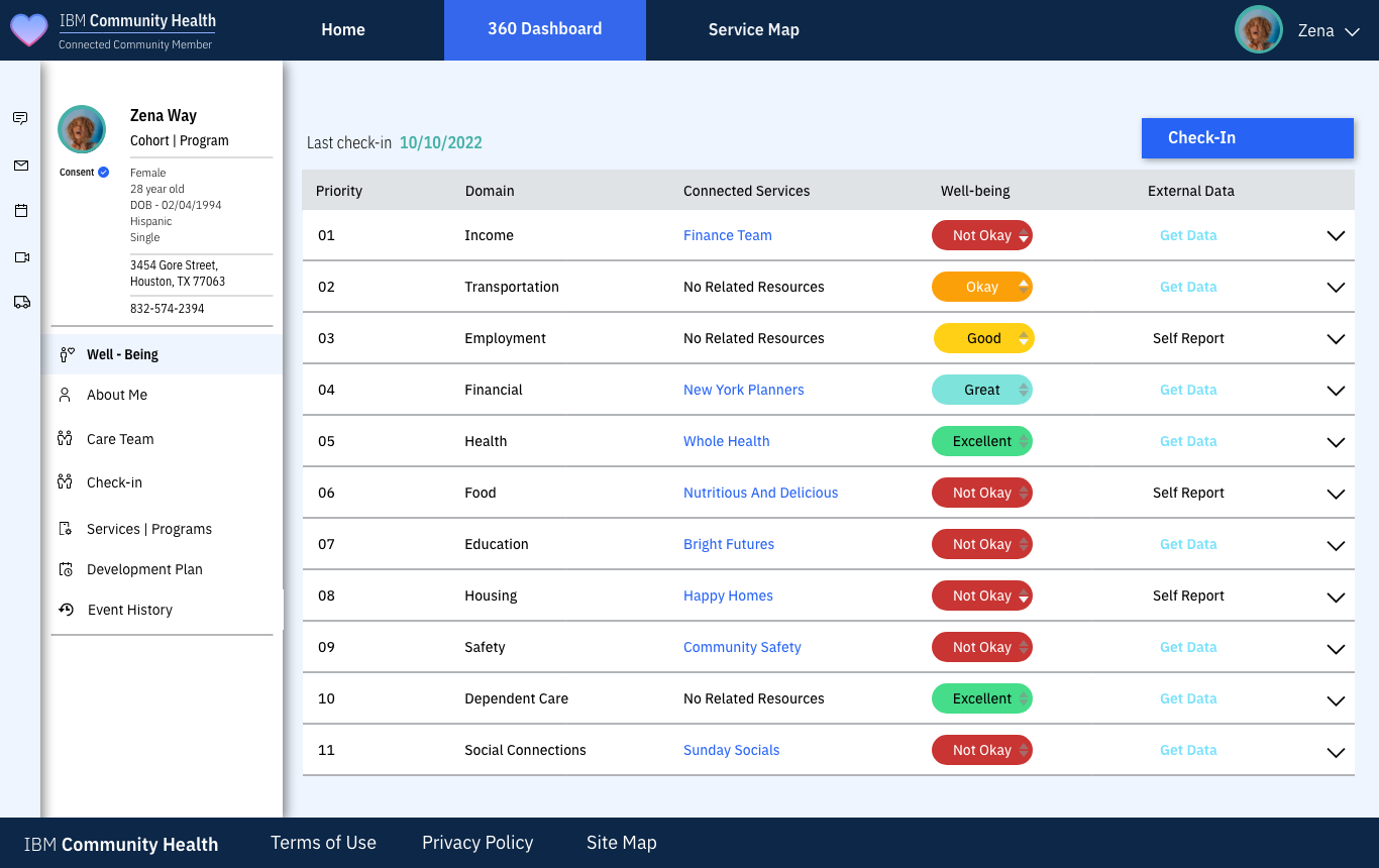
The original listed all 11 domains in a fixed order, with status shown mostly by color. The revisit summarizes first, sorts by urgency, and puts a real next step on every row, so the dashboard tells you what to do, not just what is true.

ibmch.com/dashboard/well-being
IBMCommunity Health
Find supportMy dashboardMap
Zena
Hi Zena, here's where things stand
Last check-in Oct 10 · 12 days ago
Check in now · 5 min
Needs attention
6 areas
Housing is most urgent
Getting by
2 areas
Transportation, Employment
Doing well
3 areas
Health, Financial, Dependent care
Start hereSorted by priority
AreaHow you feelWho's helpingNext step
HousingNot okayHappy HomesWaiting on youRespond
IncomeNot okayFinance TeamThu at 2:00 pmView
FoodNot okayNutritious & DeliciousUpdated 12 days agoUpdate
SafetyNot okayCommunity SafetyNo contact yetFind help
EducationNot okayBright FuturesIntake in reviewView
SocialNot okaySunday SocialsEvent this SundayRSVP
Doing fine: HealthDependent careFinancialTransportationEmployment
ibmch.com/dashboard/well-being
Before → AfterSummary before detail

Three cards say it in one glance: 6 areas need attention, 2 are getting by, 3 are doing well.

Before → AfterSorted by what matters

Rows are ranked by urgency instead of a fixed priority number, and the areas doing fine move to a compact row underneath.

Before → AfterNot just color

Every status has a text label next to its color, so it works for color-blind users and in black and white.

06.3 — Service pathway

Show why, then make it one tap.

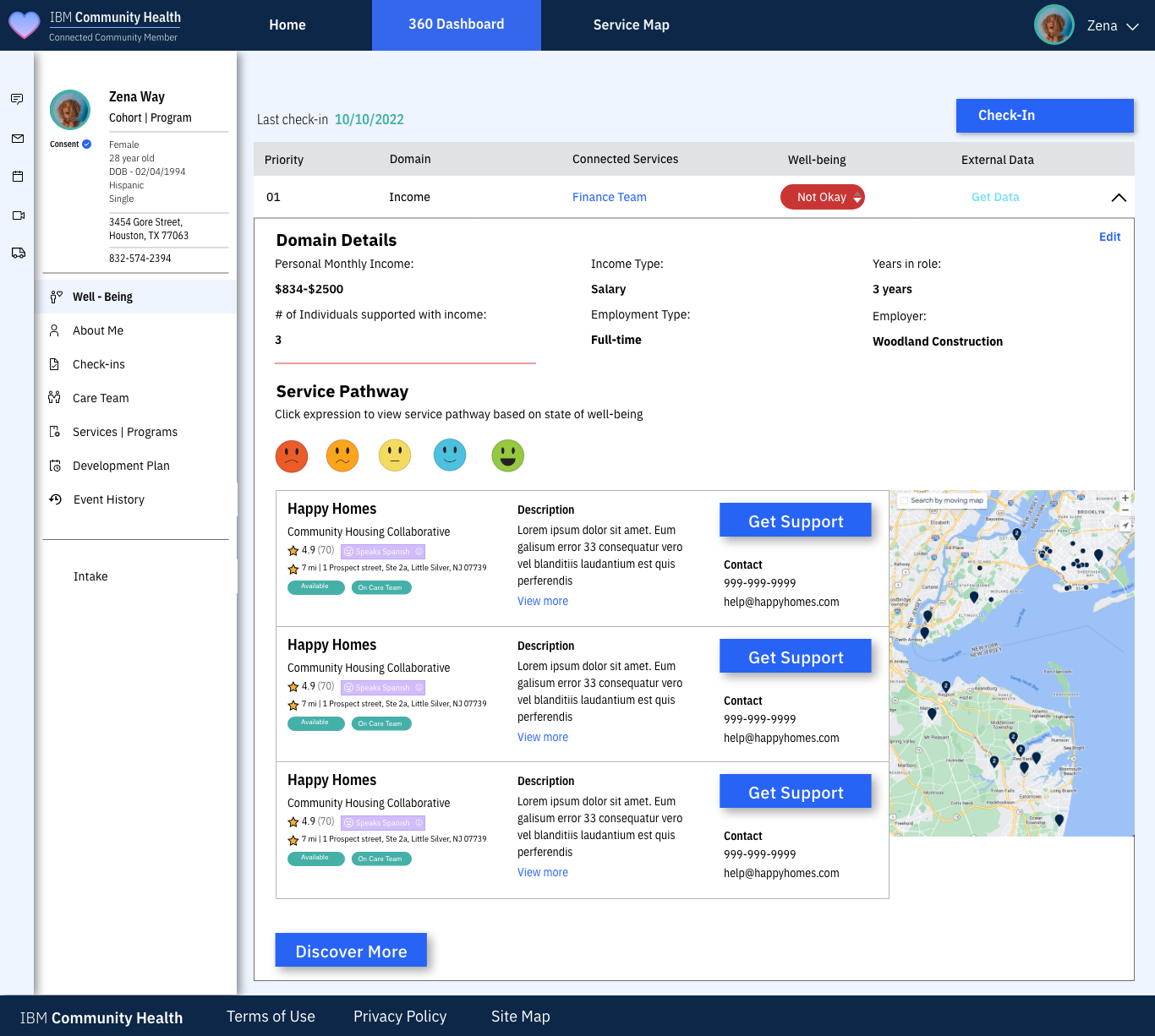
The original pathway showed the same provider three times with placeholder text, and asked people to pick a face again to filter. The revisit carries over what they already said, explains why each match was suggested, and leads with the details that decide it: wait time, distance, and language.

ibmch.com/dashboard/well-being/housing
IBMCommunity Health
Find supportMy dashboardMap
Zena
Well-being › Housing
Housing support near you
You said: Not okay
Why these? Matched to what you shared: family of 3, need something this week, prefer Spanish. Edit
Happy HomesBest match
Helps families experiencing homelessness get back on their feet with short-term housing and case support.
★ 4.9 (70)1.2 miHabla españolBeds open today
Request supportCall · Save
The Living Way
Non-profit offering housing plus support services to help people become self-sufficient.
★ 4.8 (52)3.4 miHabla españolWithin 3 hrs
Request supportCall · Save
Home Again
Helps people who were recently homeless find stable, long-term housing.
★ 4.7 (38)5.1 miHabla españolWaitlist · ~1 week
Request supportCall · Save
ibmch.com/dashboard/well-being/income
Before → After"Why these?"

A plain sentence connects the matches to what the person shared, with an easy way to edit it.

Before → AfterDecision details up front

Availability and wait time sit next to rating and distance, because "can I get in?" is the first question.

Before → AfterReal content

Lorem ipsum was replaced with real provider descriptions, and one provider is marked as the best match.

06.4 — Service requests

Group by who needs to act.

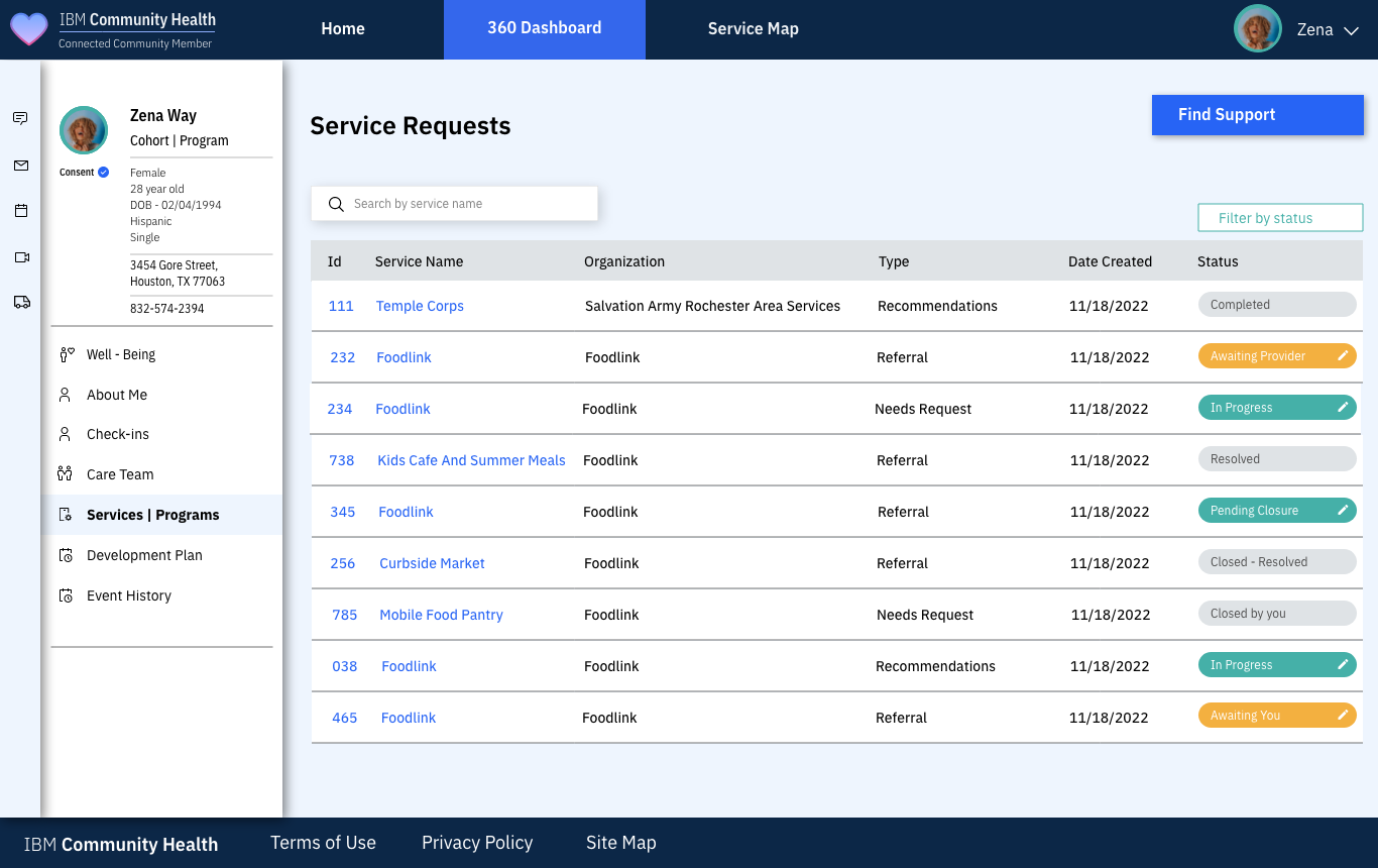
The original was a flat table where every row looked the same, and the request waiting on the user was easy to miss. The revisit groups requests by who needs to act and shows each one as a simple 4-step track.

ibmch.com/dashboard/requests
IBMCommunity Health
Find supportMy dashboardMap
Zena
My requests
9 total · updated just now
+ New request
Waiting on you · 2
Housing referral
Happy Homes · Referral
Sent
Accepted
In progress
Closed
Needs your replyReply
Kids Cafe & Summer Meals
Foodlink · Referral
Sent
Accepted
In progress
Closed
Confirm pickupConfirm
In progress · 3
Temple Corps
Salvation Army · Recommendation
Sent
Accepted
In progress
Closed
In progressDetails
Mobile Food Pantry
Foodlink · Needs request
Sent
Accepted
In progress
Closed
In progressDetails
Curbside Market
Foodlink · Referral
Sent
Accepted
In progress
Closed
Awaiting providerDetails
Closed · 4 Show
ibmch.com/dashboard/requests
Before → After"Waiting on you" first

Anything that needs the person rises to the top with a single action button.

Before → AfterStatus you can picture

Sent → Accepted → In progress → Closed replaces 8 different status pill colors.

Before → AfterLess noise

Closed requests collapse, and repeated "Foodlink" rows get real service names.

06.5 — Provider triage

Help the most urgent cases get seen first.

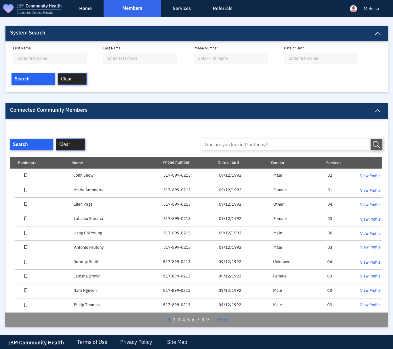
The original provider view was a member directory: search, a name list, and "View Profile". The revisit turns it into a triage queue. It pulls in "Not okay" answers from check-ins, shows how long each person has been waiting, and makes assigning ownership one click.

ibmch.com/provider/triage
IBMCommunity Health
QueueMembersServices
Melissa
Happy Homes · Provider portal
Today's triage queue
Search membersNew intake
New today
8
Urgent, unassigned
2
Waiting over 24 hrs
3
Avg. first response
6 hrs
All 14Urgent 2Mine 5Unassigned 4HousingFood
MemberFlagged from check-inSourceWaitingOwner
Zena Way
Housing+2
Check-in2 daysUnassignedAssign to me
Hang Chi Young
Safety
Self-referral26 hrsUnassignedAssign to me
Dorothy Smith
Food+1
Self-referral9 hrsMelissa R.Open
Antonio Felitony
Income
Partner5 hrsMelissa R.Open
Nam Nguyen
Social
Check-in1 hrJason T.Open
Maria Antonette
Health
Intake20 minUnassignedAssign to me
ibmch.com/provider/members
Before → AfterFrom directory to queue

Providers start the day with the people who need them, not a search box.

Before → AfterCheck-in data does work

Not-okay areas from member check-ins become flags, closing the loop between both sides of the platform.

Before → AfterClear ownership

Unassigned and time-waiting are visible, so nobody falls through the cracks.

06.6 — The rest of the original system

Everything else that shipped.

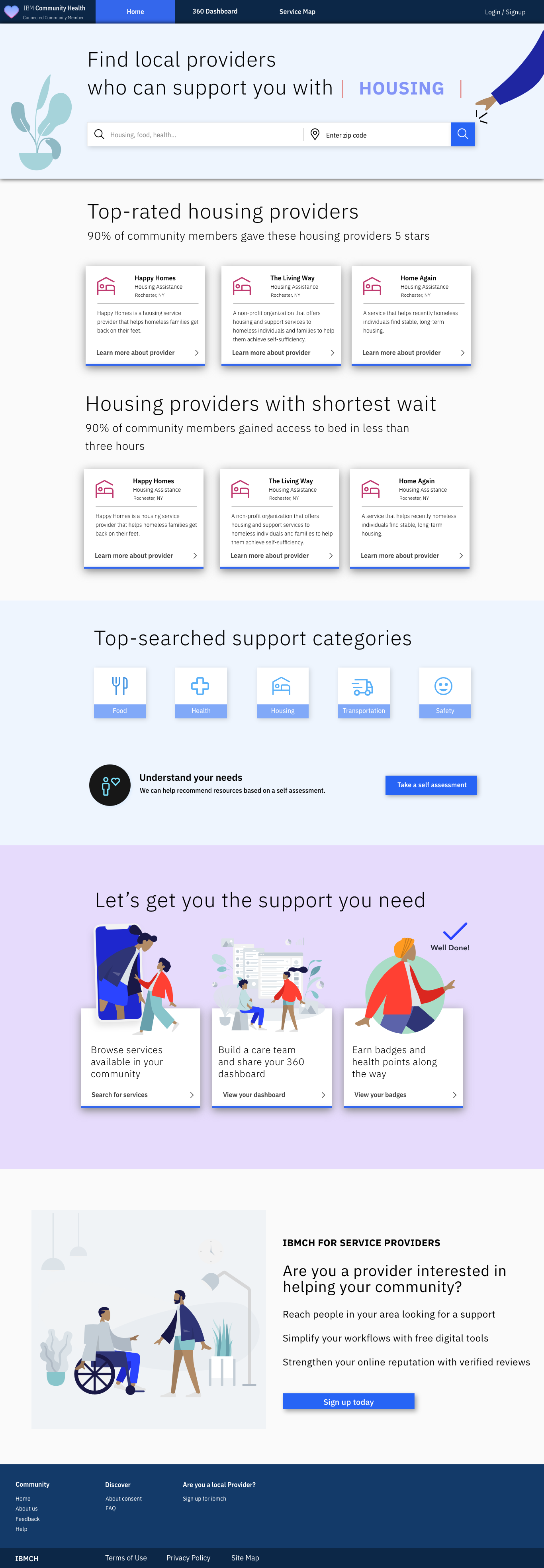
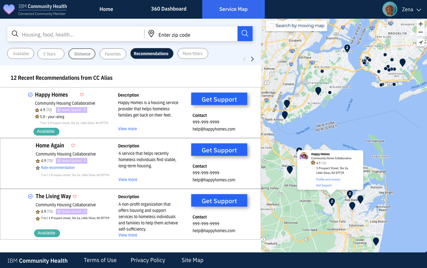
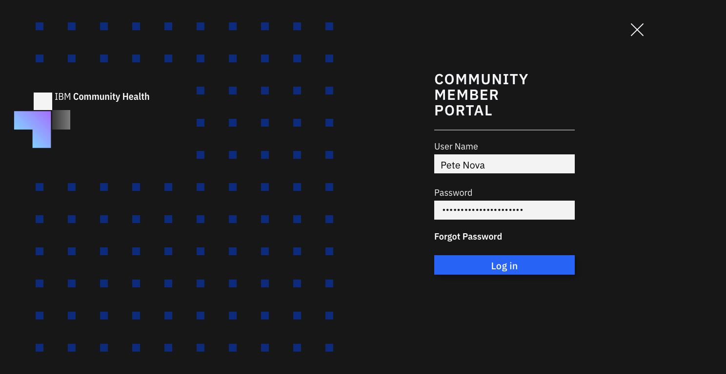
These are the original screens that the revisit builds on: the home page and map, login, check-in, and the rest of the 360 Dashboard.

ibmch.com

Scroll inside the frame to see the full home page.

ibmch.com/service-map

List and map in sync, with filters for availability, rating, and distance.

ibmch.com/login

A dedicated community member portal.

ibmch.com/check-in

Desktop self-assessment, one domain at a time.

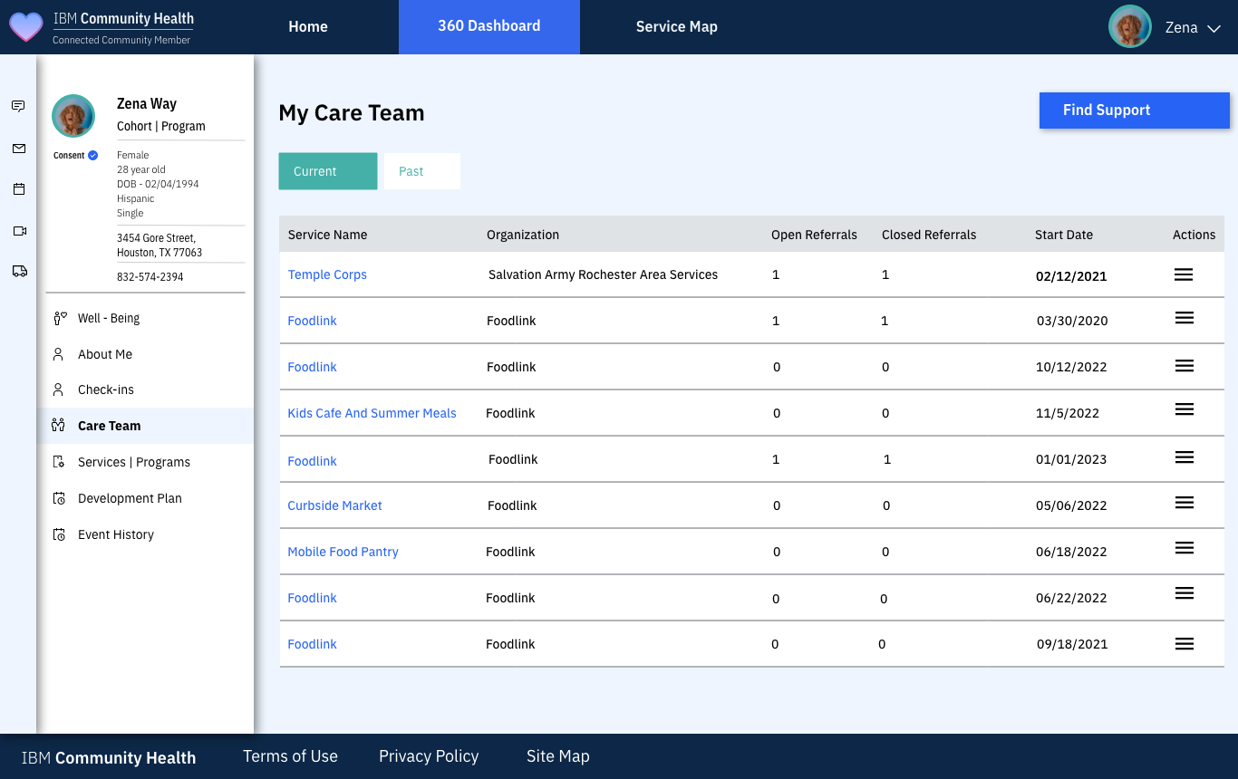
ibmch.com/dashboard/care-team

Every organization supporting the person, current and past.

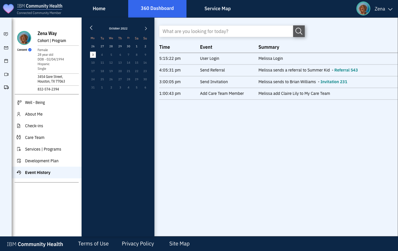
ibmch.com/dashboard/history

A time-stamped activity log for accountability and continuity of care.

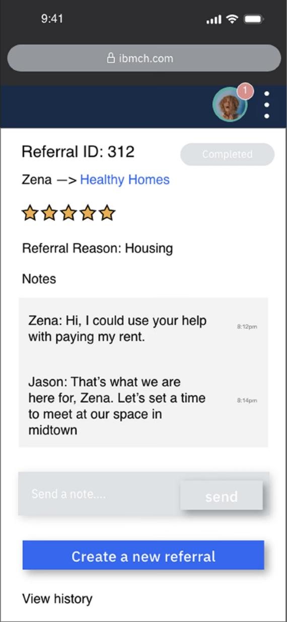
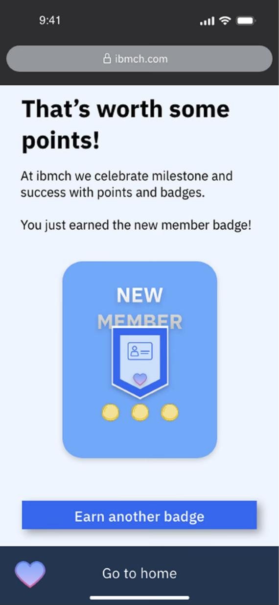
A referral thread and the new-member badge on mobile.

07In the real world

Powering Hope Florida.

Community Health 360 was used to power Hope Florida, an initiative that connects individuals and families with essential community resources.

People could self-refer into programs, track their service requests, and stay in touch with their care teams, all in a mobile-friendly experience. For providers, it simplified intake, referrals, and case management by putting the data in one place with real-time visibility. That made coordination between agencies much smoother.

It also proved the design could scale beyond pilots. The same platform, rebranded, supported a real state-level initiative.

Self-referralService request trackingCare teamProvider intakeWhite-label theming
your-program.org/dashboard
IBMCommunity HealthHope FloridaConnected Community MemberYour City Cares
Zena
Welcome back, Zena
Same product. Your brand, your programs.
Open requests
5
Care team
4 orgs
Check in now

Try it: switch the theme. Only design tokens change, the layout and components stay the same.

08Reflection

What I learned, and what I'd do next.

Takeaways

  • 01
    The original did the hard partThe system, the modules, and the two-sided model are why the revisit was mostly about decisions, not rebuilding.
  • 02
    Data should lead to an actionThe biggest upgrade was not visual. It was making every status point to a next step.
  • 03
    Close the loopCheck-ins are most valuable when providers see them. Connecting both sides is where the product gets better for everyone.

If I took it further

  • →
    Test the revisitRun the new check-in and well-being overview with community members and compare time to first request.
  • →
    Language and literacySpanish and plain-language versions of the check-in, tested with real users rather than translated after the fact.
  • →
    Notifications that helpNudge people when something is waiting on them, and stay quiet otherwise.
How success was measured

The numbers that mattered

Search time

How long it takes people to find the resource they need. Down 40%.

Engagement

How actively people use the platform across devices. Up 35%.

Resource discovery

How many resources people find and connect with. Up 50%.

Scale

Moving beyond pilots to a state-level initiative, Hope Florida.