The last aisle before checkout
On Albertsons Companies' monetization team, I designed “Don't Forget to Add,” a quick stop between the cart and checkout on Safeway.com. It gives shoppers one more look for the things they always forget, makes room for personalized and sponsored products, and is built from the same design system as the rest of the site.
Shoppers were heading to checkout without everyday staples, and the business had no good spot before checkout to suggest them, personalized or sponsored.
Mapped the path from cart to checkout, designed the mini cart and the DFTA page, tested both with shoppers, and turned what we heard into design rules.
A useful, skippable last stop before checkout with clearly labeled sponsored rows, built from existing design system parts so it looks and acts like the rest of Safeway.com.
Two goals sharing one checkout
Albertsons Companies runs Safeway, Albertsons, Vons, Jewel-Osco and more on a shared e-commerce platform. I was on the monetization team, which handles the places across the site where products get promoted. Some of that is personalized (“you buy this every week”) and some of it is paid for by brands.
The cart was the obvious opportunity. It's where intent is strongest, and it's the last chance to catch the milk someone forgot before the order is locked in. But checkout is also the most fragile part of the funnel. Anything that feels like a sales pitch there costs trust, and sometimes it costs the order.
Don't make me hunt or wait
- Remember the staples I always buy
- Get to checkout quickly and without surprises
- Know when something is an ad
Grow basket size, responsibly
- Last-minute add-ons that raise order value
- Sponsored placements brands can buy
- One pattern that works on every banner
…give shoppers a last look at what they might've missed, so it feels like a helpful store employee and not a checkout-lane candy rack?
How other stores handle the last stop
Before designing anything, I ran a competitive and comparative analysis of five major retailers: Amazon, Walmart, Target, Kroger and Whole Foods. I wanted to see what each one does differently with monetization: where they suggest products, how they handle sponsored items, and what happens in the moments right before checkout.
The goal wasn't to copy anyone. It was to find patterns shoppers already know, and figure out which ones would feel at home on Safeway.com.
Amazon does the last stop best
After you add something to your cart, Amazon shows a page of its own with related and frequently-bought-together items, and a big checkout button still right there.
Checkout is never more than a click away
In the best versions, suggestions show up while you're reviewing your order, and never get in the way of finishing it.
Everyone sells ads. Honesty is the difference.
All five make money from sponsored products through their own ad networks (Whole Foods through Amazon's). Wanting ad space wasn't unusual. How clearly it's labeled is what sets a site apart.
Where products get placed
I started by mapping each step from browsing to checkout and marking every product placement along the way. Seeing all of them in one view made it clear which ones were organic, which were personalized and which were paid, and where a new stop could sit without blocking anything.
Browse & product page
Shoppers find items in search, aisles and product detail pages.
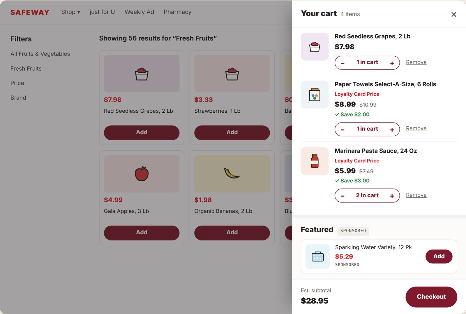
Mini cart fly-out
Opens from the cart icon so shoppers can review without leaving the page.
Don't Forget to Add
A new, skippable step after clicking Checkout: “Got everything you need?”
Checkout
Delivery or pickup time and payment. This step's only job is getting the order placed.
Testing it before it went live
We built a clickable Figma prototype of the whole path, from adding grapes to the cart to opening the mini cart to reaching DFTA, and ran a moderated usability test with shoppers. People thought out loud while they completed tasks, so we heard their reactions as they happened, not after the fact.
The script went beyond “can you use it.” It also asked whether this step belonged in checkout and whether people could tell sponsored products apart from personalized ones.
Is the step expected?
Does landing on DFTA after clicking Checkout feel natural or like a detour?
Is the purpose clear?
Do people get why the page is there within a few seconds?
Are the picks useful?
Which rows actually help, and what would make recommendations better?
Is sponsored obvious?
Can shoppers spot paid placements, and how do they feel about them?
- 01You're shopping online and have already added items to your cart. Add “Red Seedless Grapes” to your cart.Task
- 02Now start the checkout process. Click the cart icon in the upper right corner of the screen to open the cart fly-out.Task
- 03What items do you see in your cart?Verbal
- 04Is there any content in the cart that you feel is out of place?Verbal
- 05What comes to mind when you see the “Featured” headline and content?Verbal
- 06Continue the checkout process. Click “Checkout” now.Task
- 07What's your reaction to seeing this page as part of checkout? What do you think it's for?Verbal
- 08Is this the page you expected to see after clicking Checkout?Verbal
- 09If Safeway gave you recommendations before checkout, what changes to this page would fit your needs better?Verbal
- 10Some products here are based on your buying habits and some are sponsored. Can you tell which are sponsored, and how do you feel about sponsored content on this page?Verbal
- 11How would you complete your order from here?Verbal
The prototype DFTA page
- A plain question as the headline. “Got everything you need?” explains the page without any marketing language.
- Three rows, three reasons. Buy it again (your history), Recommended for you (your cart), Featured Items (brand partners).
- Add right in the row. The same Add button as everywhere else on the site, so nobody has to leave the page.
- A clear way out. “Continue to checkout” sits at the bottom of the page, with the estimated subtotal at the top.
Sorting what we heard
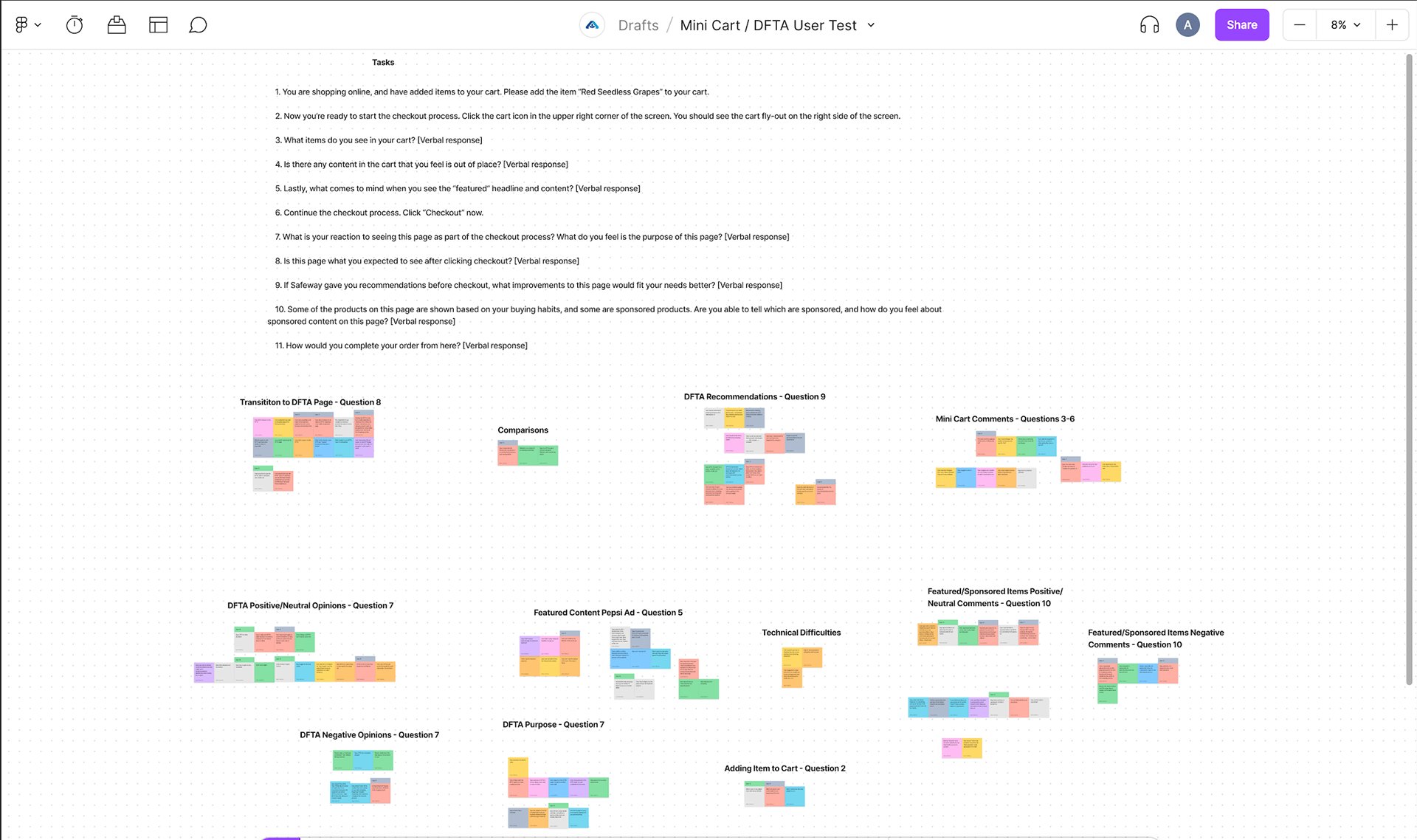
Every session became sticky notes in FigJam, one color per participant, grouped by the question that prompted them. Then we regrouped across questions until themes showed up, splitting positive and negative reactions so the loudest opinions didn't drown out the rest.
A pause is fine if it's quick and makes sense
A stop after clicking Checkout wasn't what people expected. It went over better when the purpose was obvious and the way forward stayed in view.
“Buy it again” does most of the work
Items from someone's own order history came across as a reminder, not a pitch. Generic picks landed better when they clearly connected to what was already in the cart.
Ads are okay when they're honest
Sponsored products were generally fine as long as people could tell they were ads. Small labels on single cards were easy to miss, and that's when it started to feel sneaky.
A brand banner in the cart feels off
The “Featured” brand ad under people's own items drew “out of place” reactions. It wasn't a product they could add, so it read as an interruption.
Rules for the last aisle
I turned the themes into four rules the team could use to settle debates. These came in handy whenever someone asked for one more placement.
Helpful before profitable
The page earns its spot with the shopper's own items first. Sponsored products come after that.
Never block checkout
One step, skippable, with the checkout button always visible. No pop-ups, no gates.
Every paid slot says so
Sponsored is labeled on the row and on the card, in the same place every time.
Built from the system
Same product cards, buttons and prices as the rest of the site, so it feels native on every banner.
“Got everything you need?”
The DFTA page puts the four rules to work. Personal rows come first, each item says why it's there, the sponsored row is clearly marked, and checkout stays visible the whole time. Try it: add a few items and watch the subtotal update.
Got everything you need?
A last look before checkout. Skip anytime.
Buy it again
From your past ordersGoes with your cart
Based on what you've addedFeatured items
SponsoredPaid placements from brand partnersInteractive version of the DFTA page. Product art is simplified for the case study.
Ad space that plays by the rules
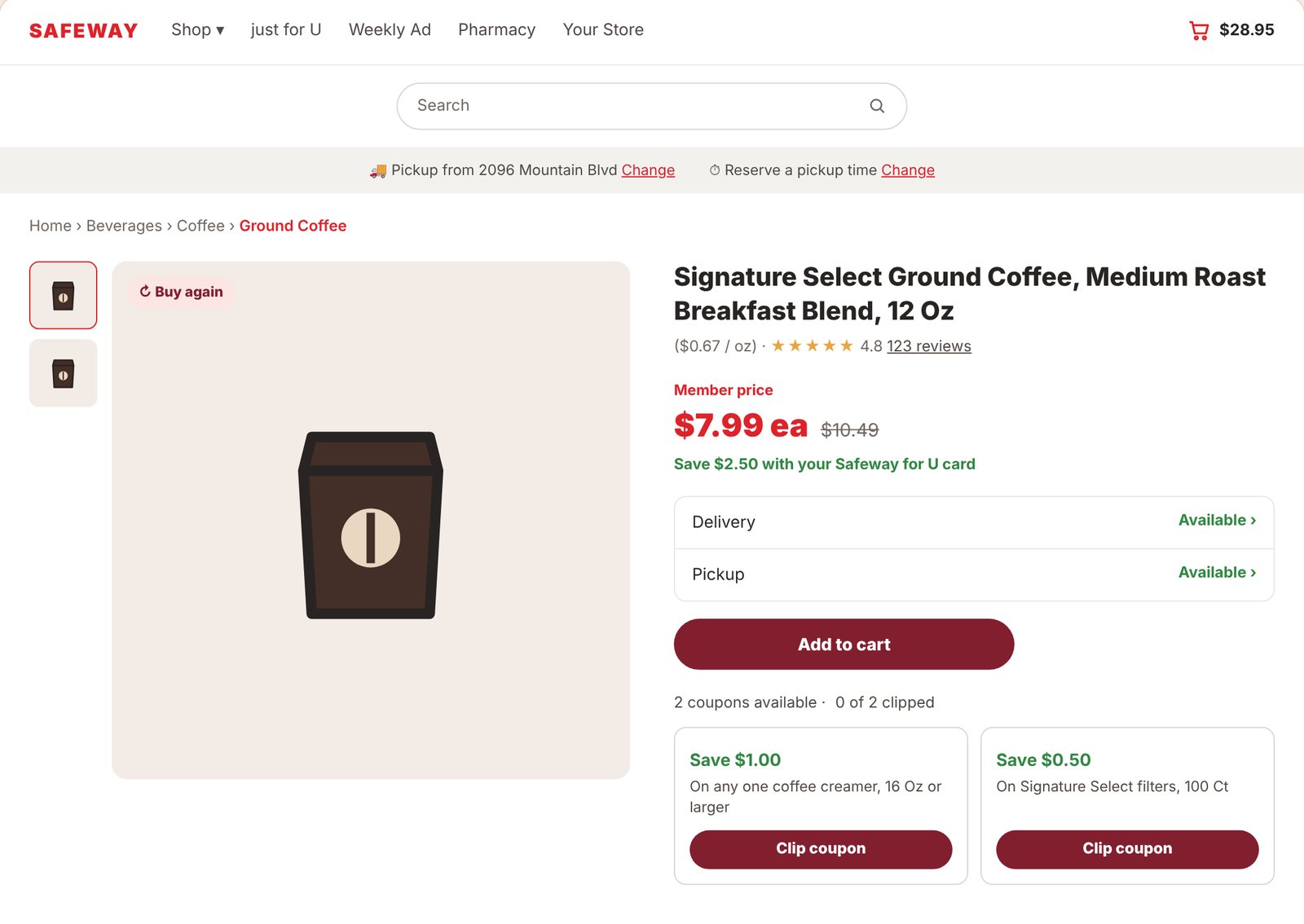
Monetization reaches past checkout. I also worked on product detail pages, where carousels and display ad units have to share a page without crowding the product, and on the mini cart, the first place people review what they're buying.
For the PDPs I documented exact ad sizes and spacing so engineering and ad ops had one source of truth across desktop and tablet. I also mapped every Google Ad Manager (GAM) slot on product pages so ad ops knew exactly what could run where. Try it: switch views, clip a coupon or change quantities.
Signature Select Ground Coffee, Medium Roast Breakfast Blend, 12 Oz
On any one coffee creamer, 16 Oz or larger
On Signature Select filters, 100 Ct
Most popular
In Ground Coffee3Related products
Pairs with this item300 × 250
300 × 250
Signature Select Honey Oat Cereal, Family Size, 18 Oz
Kept clear of the price and Add to cart.
Sponsored products
SponsoredNative ads served by GAM3Customers also bought
Organic recommendationsOne card, every banner
Albertsons runs many grocery brands on one platform, so nothing could be a one-off. I built everything here from existing design system components, and a big part of the job was cleaning up places where the system had drifted, like mismatched cards and buttons from page to page.
Using the same product card on PDPs, in the mini cart and on DFTA meant shoppers already knew how to use the new page, and engineering could ship it without building new parts.
Fixed-ratio container, so rows line up no matter the packaging.
Brand red for price, small gray unit price for comparing.
Clamped to two lines, size always included.
Coupons and loyalty deals in savings green, clippable right on the card.
The new slot: why it's here, or “Sponsored.” Same position every time.
Turns into a quantity stepper after adding, same on every surface.
What we walked out with
DFTA went from an idea to a tested, system-built step in the Safeway.com checkout flow, with shopper feedback and clear rules behind every placement choice.
A new checkout step
“Don't Forget to Add” gave shoppers a last chance to grab staples and gave the business a new spot for personalized and sponsored products.
Rules for sponsored content
Row and card labels, plus a hard line between personal and paid, gave the team a standard to apply to every new placement.
A more consistent system
Shared cards, buttons and ad-slot specs across the PDP, mini cart and DFTA brought the pages back in line with the design system.
| Metric | Target | Why it matters |
|---|---|---|
| Average order value | Up | The core monetization goal: more of the list ends up in one order. |
| DFTA add rate | Up | Shows whether the page is actually useful, not just seen. |
| Checkout completion | Holds steady | The guardrail. A new step that costs orders isn't worth it. |
| Sponsored engagement | Up | What brand partners pay for, tracked separately from personal rows. |
| “Forgot an item” follow-up orders | Down | Fewer small second orders means people got what they needed the first time. |
Monetization is a trust problem
The biggest lesson from this project: shoppers pushed back on surprises far more than on promotions. When a page explains itself, respects their time and is upfront about what's paid, people treat it as a service.
Next, I'd push for A/B testing DFTA placement (after the cart vs. inside the mini cart) and give the “why” labels more room. Those small reasons are cheap to add, and they change how the whole page reads.